Revamping the digital identity of an ed-tech non-profit's website
trubel&co sought a website redesign to make information more accessible for students and to better engage donors in their mission.
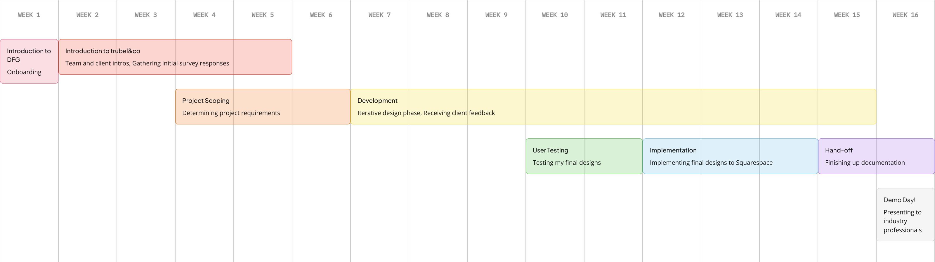
Through Develop For Good's SU25 cohort, I joined the student team supporting trubel&co (pronounced trouble). The previous phase of work focused on redesigning their design system for accessibility, and this new phase applied that system to additional pages that had not yet been updated.
I redesigned 4 pages to better streamline relevant information, improve navigation, and highlight essential content using their new accessibility-focused design system.
My team redesigned a total of 6 pages to streamline information, improve site architecture, and make it easier to find relevant information by audience type, all while implementing the new accessibility-focused design system.
I contributed by developing 3 of those pages (1 of which is to be treated as a page template) and updating 12 blog posts, eliminating redundancies and highlighting the most important information for users.
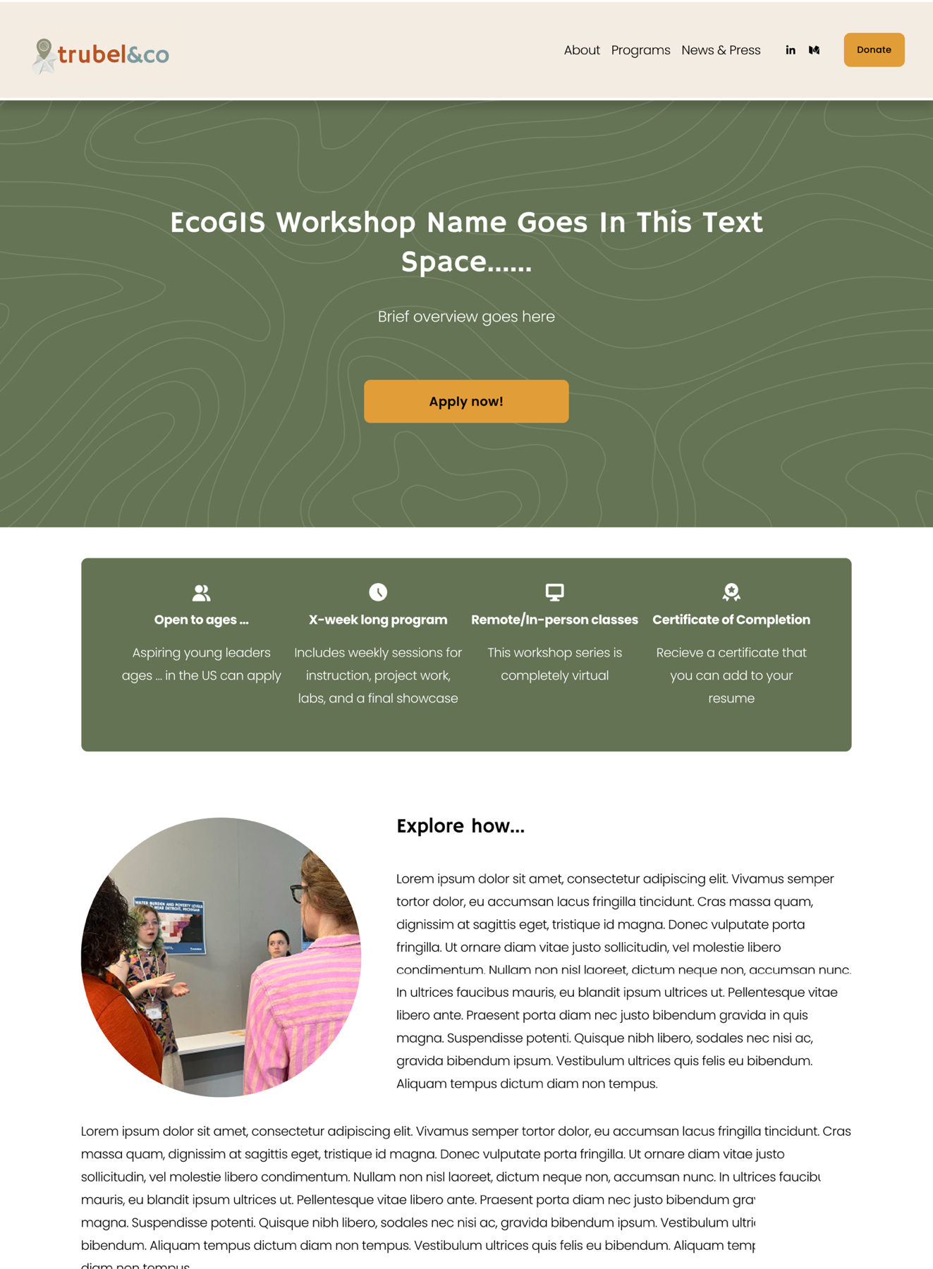
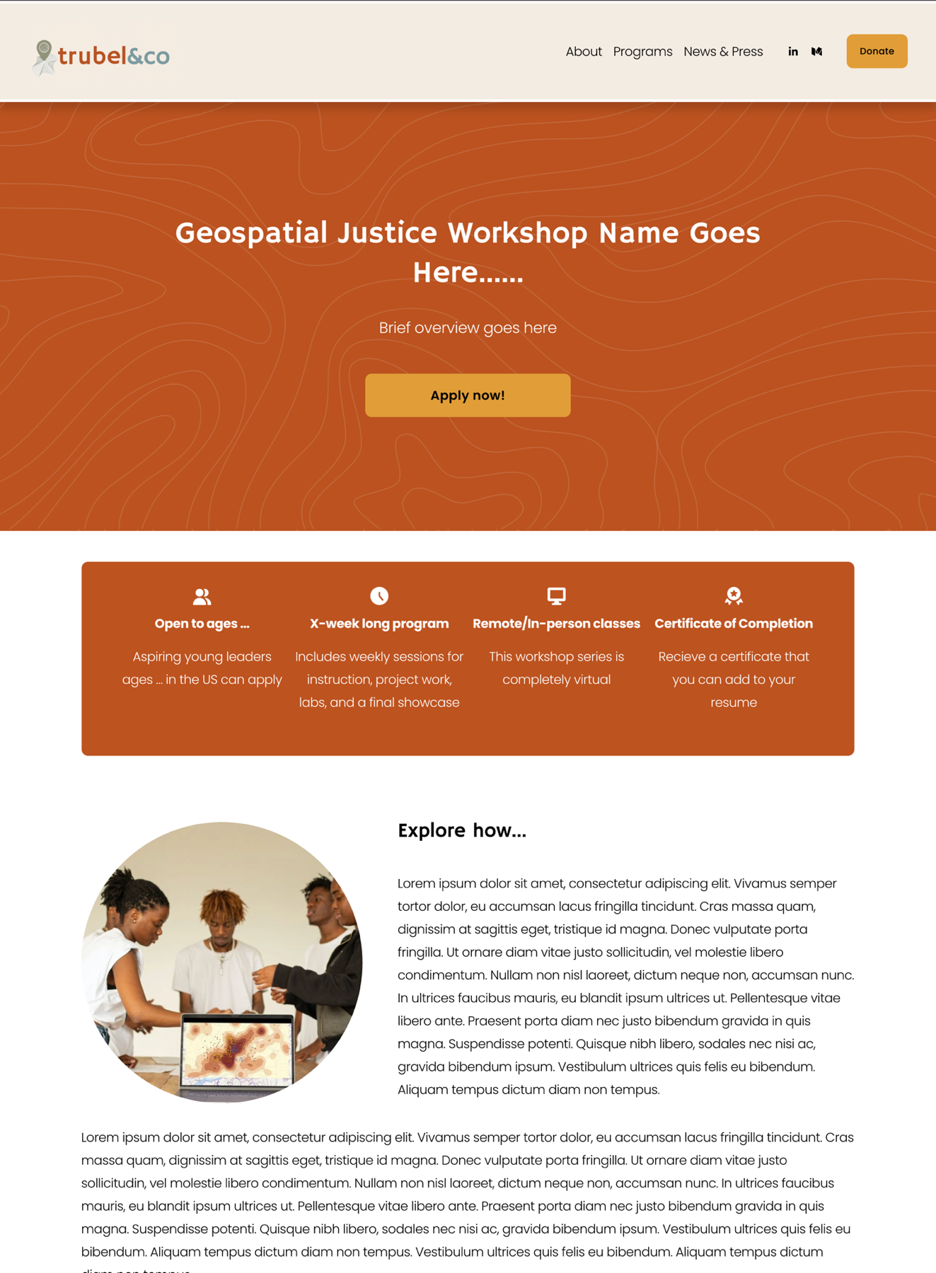
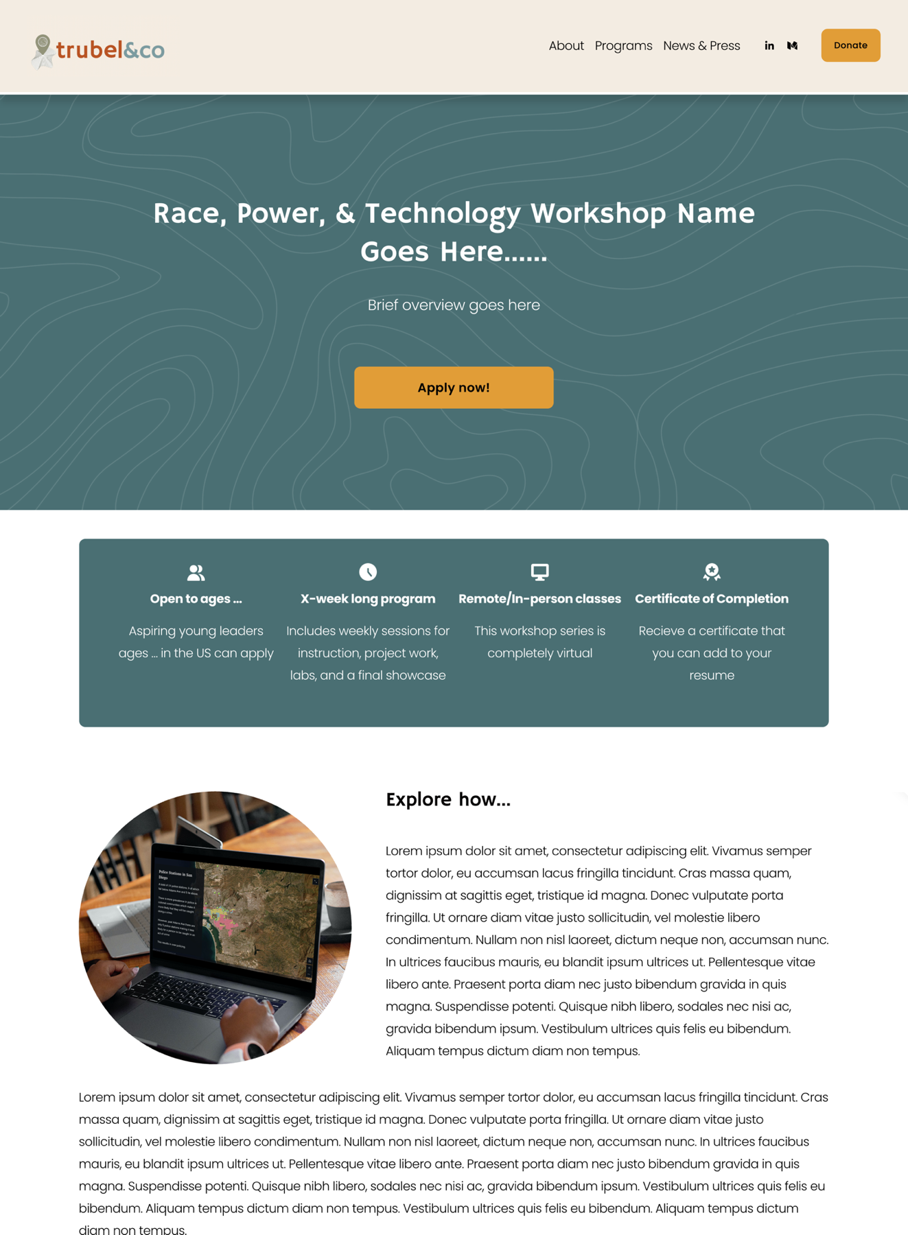
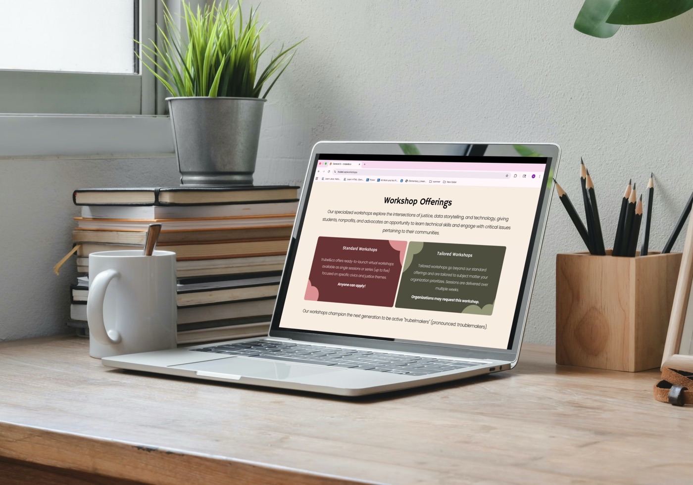
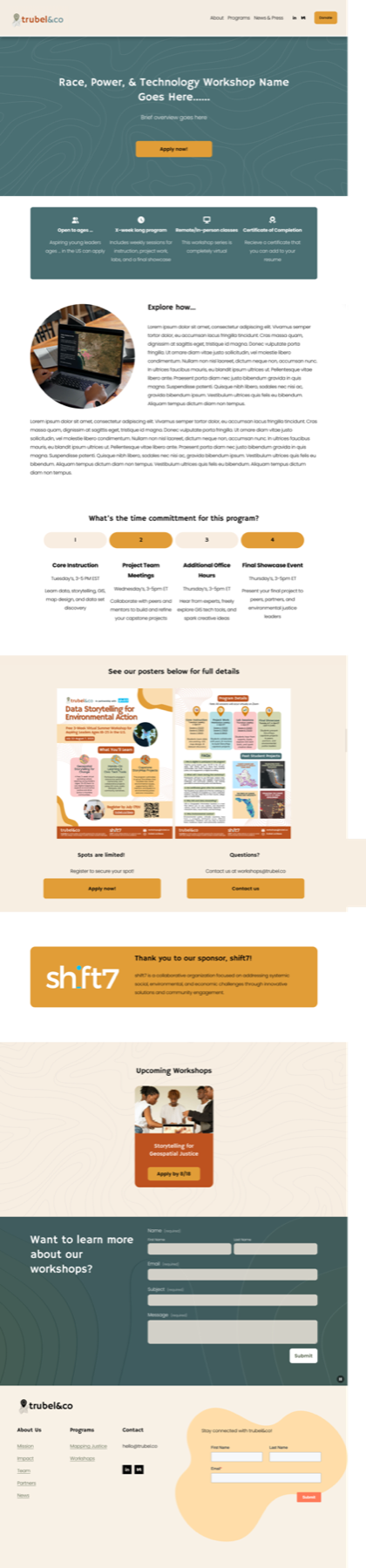
Workshops goes over event types, themes, and availability.
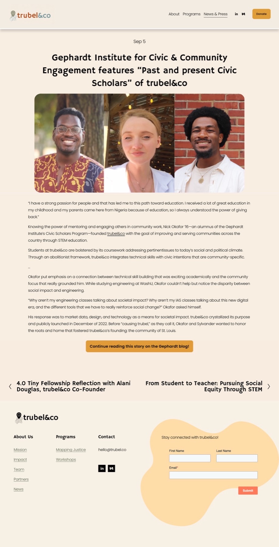
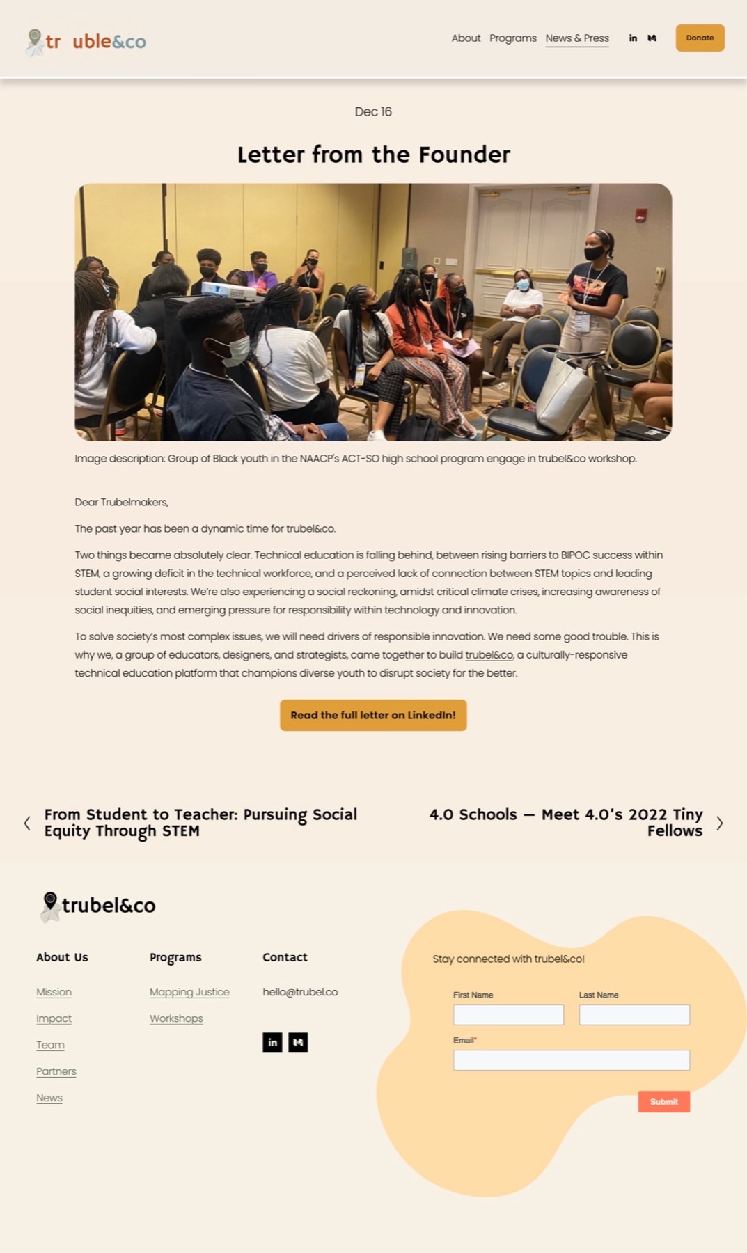
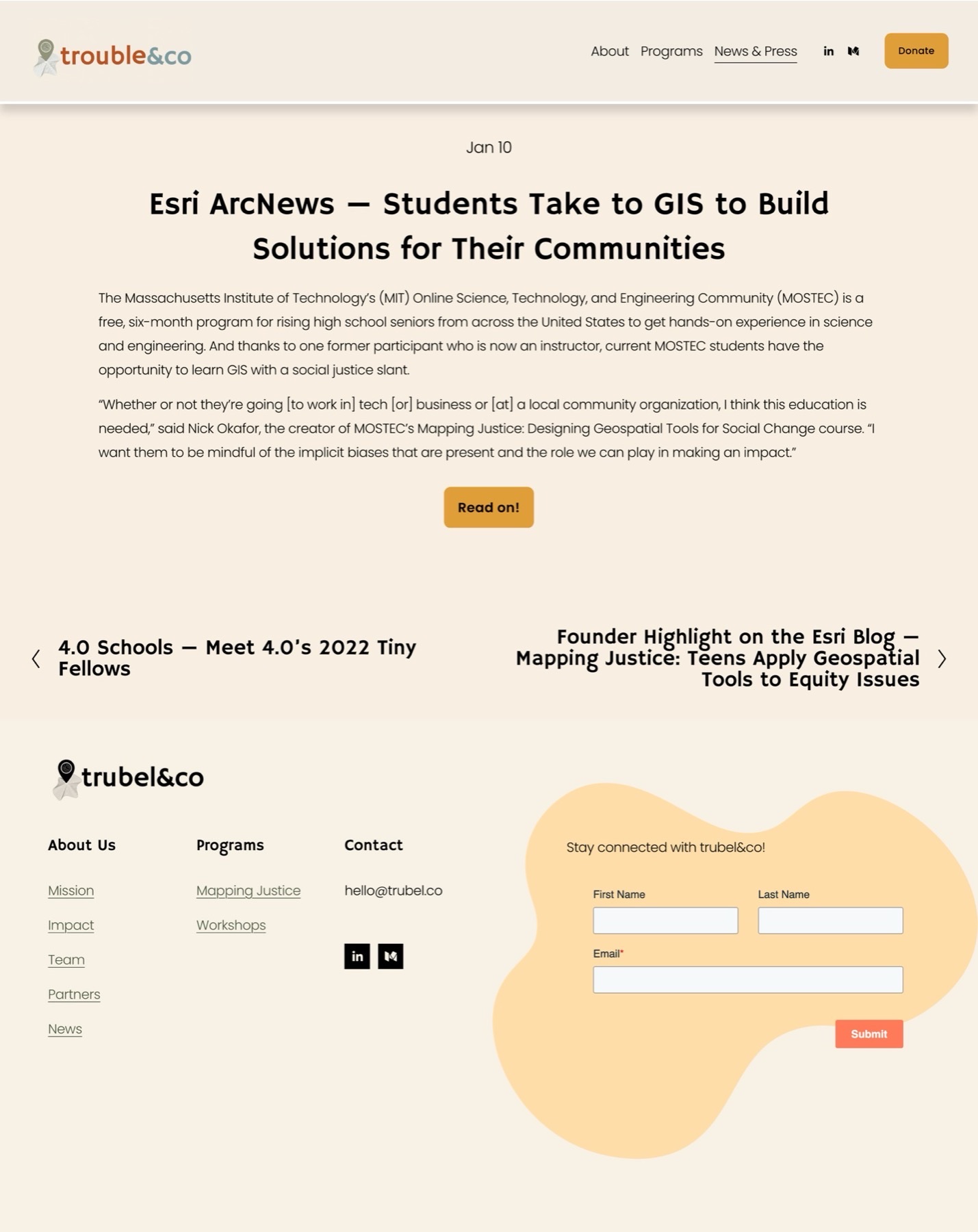
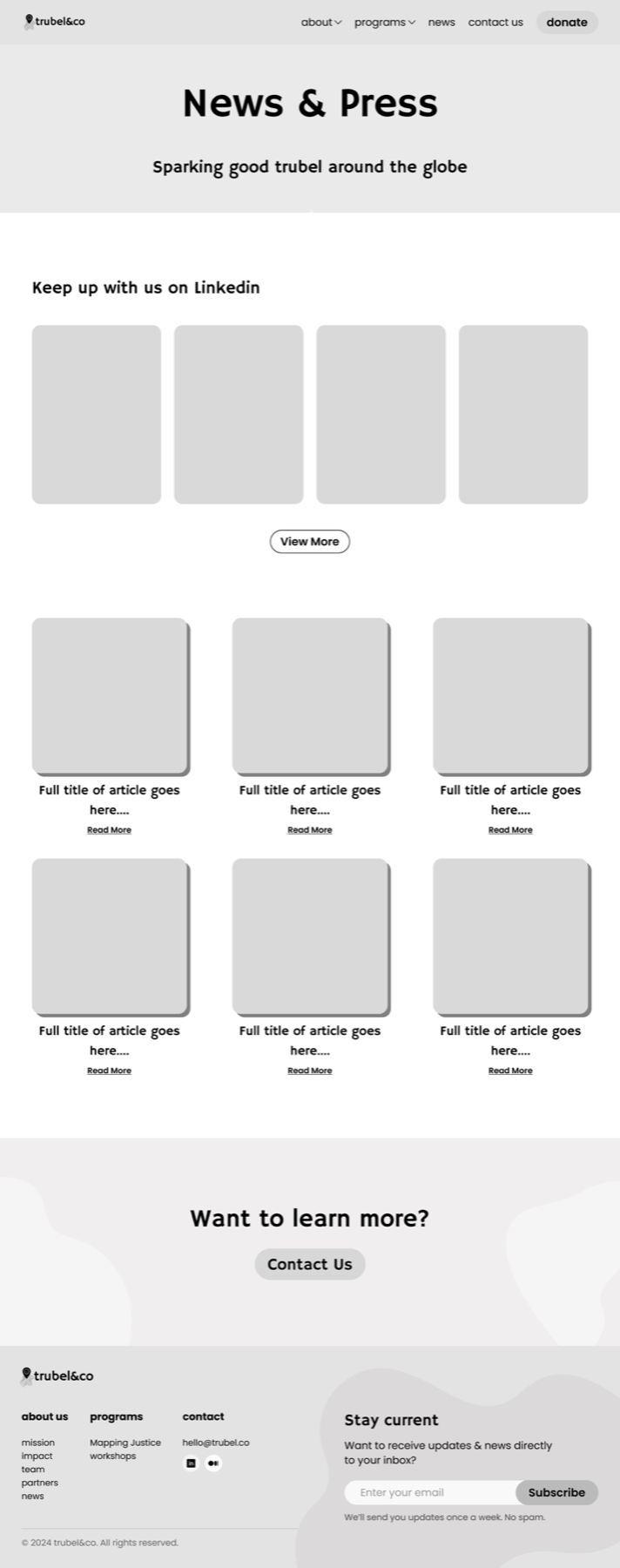
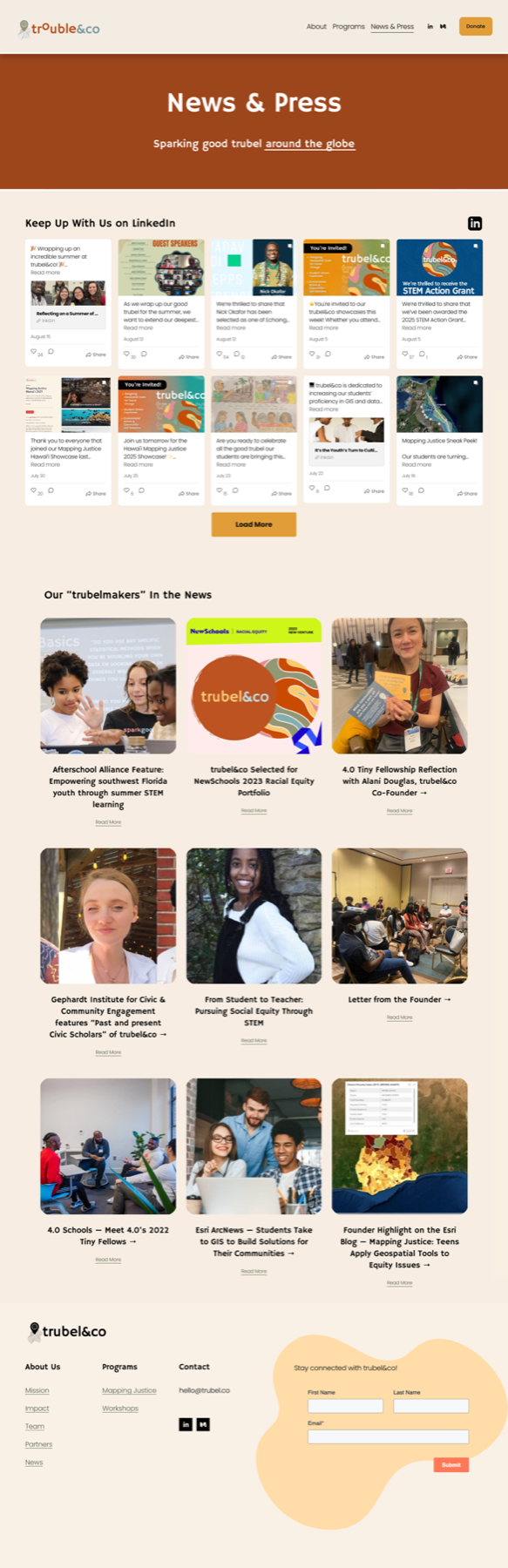
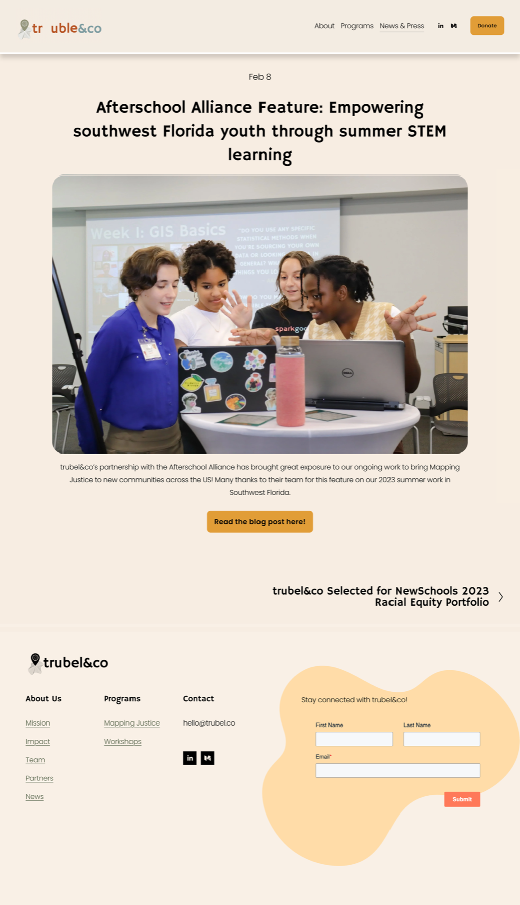
News & Press provides ongoing and past activities from the trubel&co team.
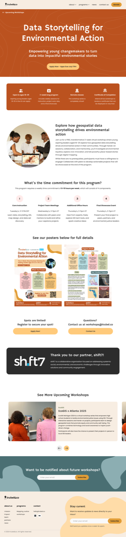
An individual workshop page provides specific details about an upcoming workshop.
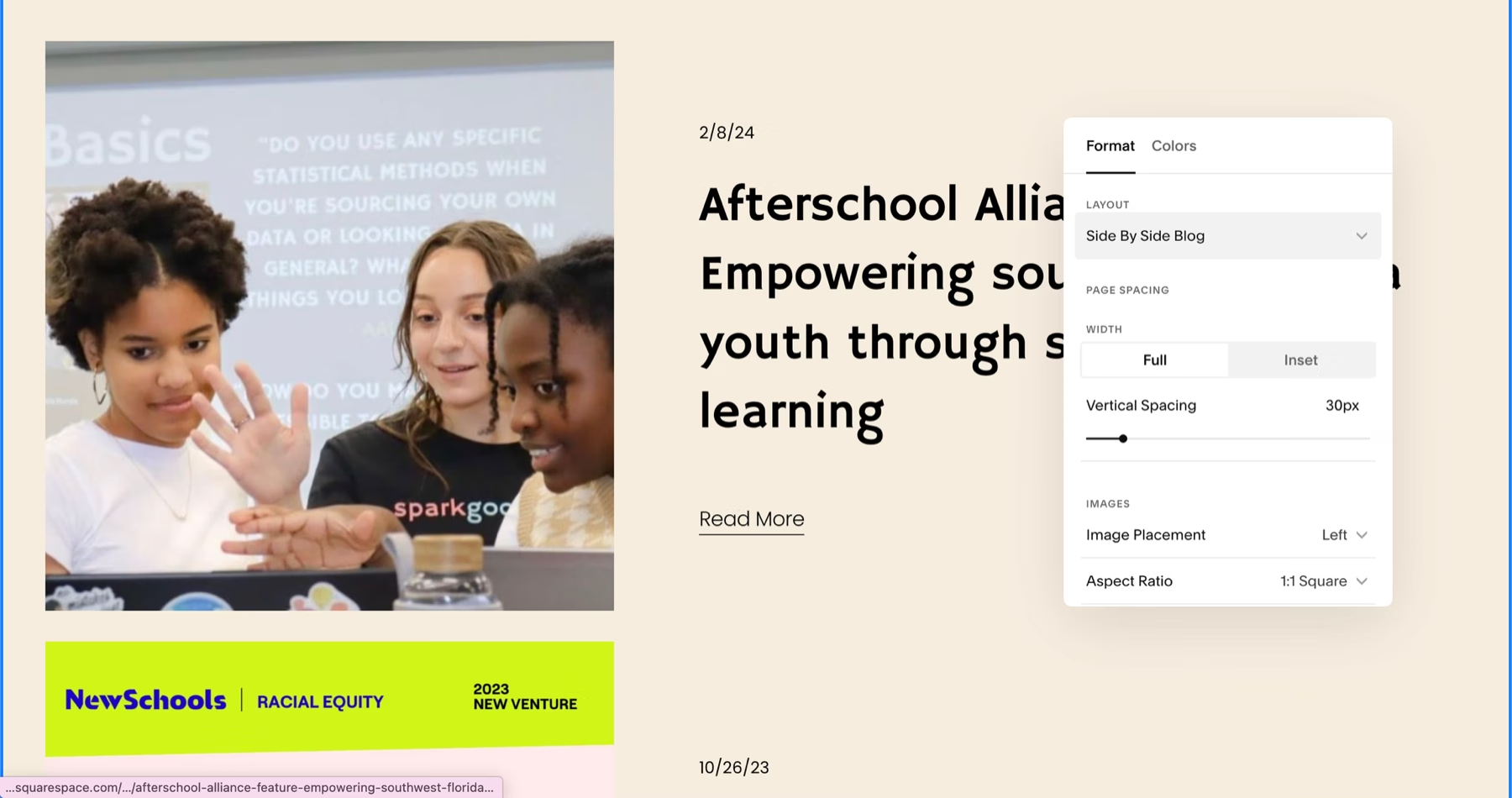
Blog posts (12) detail achievements made by the trubel&co team.
My contributions were approved to be added directly to their Squarespace website!
You can check out their website at here, with a positive testimonial from the client down below.
2025 Q3
Release Date
100+
potential students reached
100%
of users* found the layout easier to digest
*Out of 10 interviewed users
But how did I get here?
trubel&co empowers underrepresented STEM students and nonprofits to drive environmental and social impact in their communities.
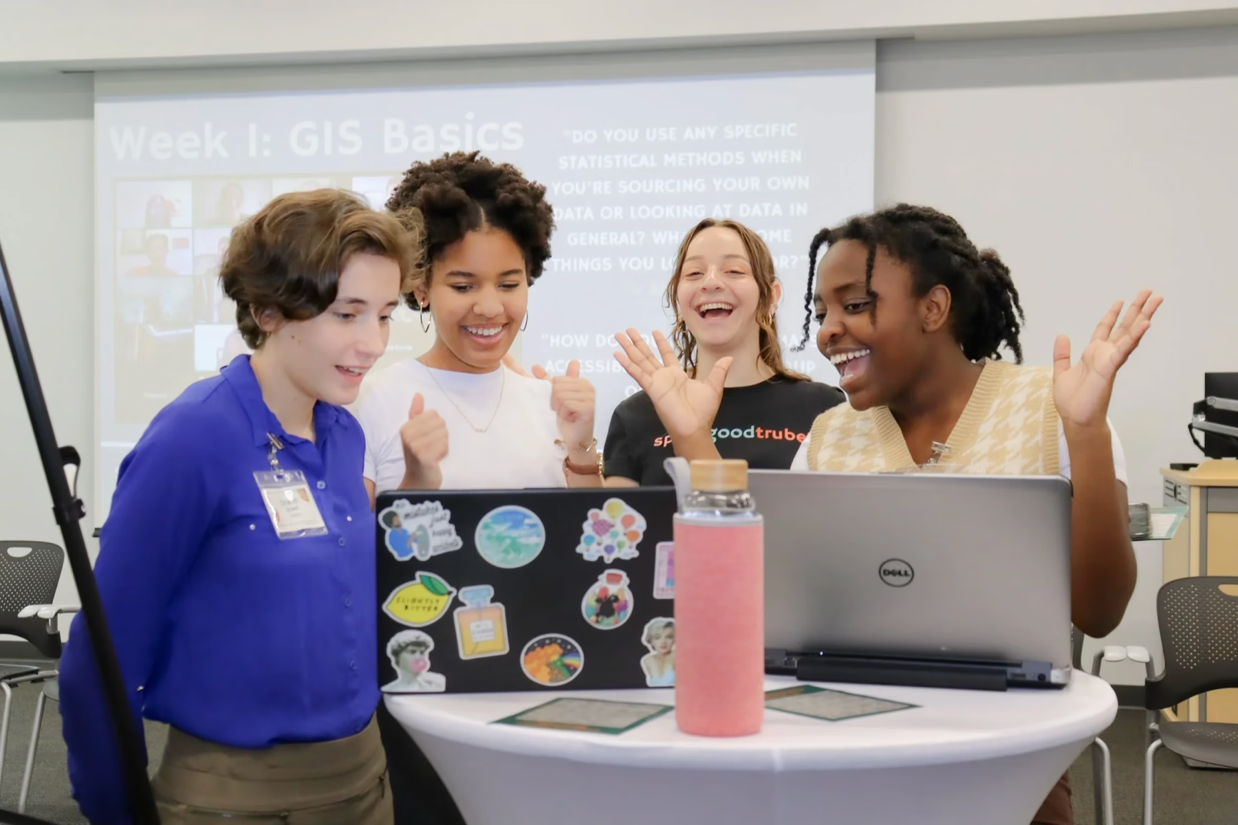
trubel&co is an ed-tech non-profit. Through their Mapping Justice program and various workshops, trubel&co teaches students and nonprofits an array of skills to create social impact.
They had previously worked with DFG the past cohort to create the new design system.
Building on the previous team's foundation, I was responsible for redesigning 4 pages that would need to be managed by non-designers.
Though my work was initially scoped to the Workshops page, I identified additional gaps and ultimately redesigned 3 more pages — all within Squarespace to keep the design simple enough for the trubel&co team to manage after handoff.
All four pages struggled with oversized text, dominant images, and poorly optimized information.
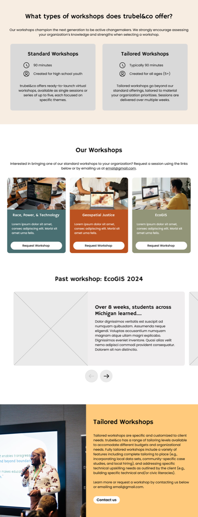
As two core pages of the website, the Workshops and News & Press pages needed updates to meet user expectations and match the new design system.
Workshops
News & Press
Although these next 2 pages weren't originally part of the redesign plan, I saw opportunities to enhance the user experience for visitors wanting to learn about workshops, sign up, or understand trubel&co's ongoing and past impact.
Workshops (Individual)
Blogs
Using Qualtrics, we gathered users' thoughts about the current website.
We received overall positive feedback on the design, layout, and clarity across most pages, including the News & Press page. However, the main pain points arose on the Workshops page, particularly due to a lack of specificity and clarity about past and upcoming workshops, which aligned with what I initially observed.
Since the individual workshop and blog pages were not intially considered for the project yet, they were not included as part of this survey.
Confusion over workshop availability
Respondents were confused by the difference between signing up vs. requesting a workshop, not realizing the page served 2 audiences: students applying and organizations hosting.
Information overload
The Workshops and News & Press pages were described to have redundant or clunky text, with respondents suggesting that we improve skimmability.
Lack of concrete examples
Respondents mentioned a lack of clear workshop examples and a desire to see past workshops or more information about what activities are involved in workshops.
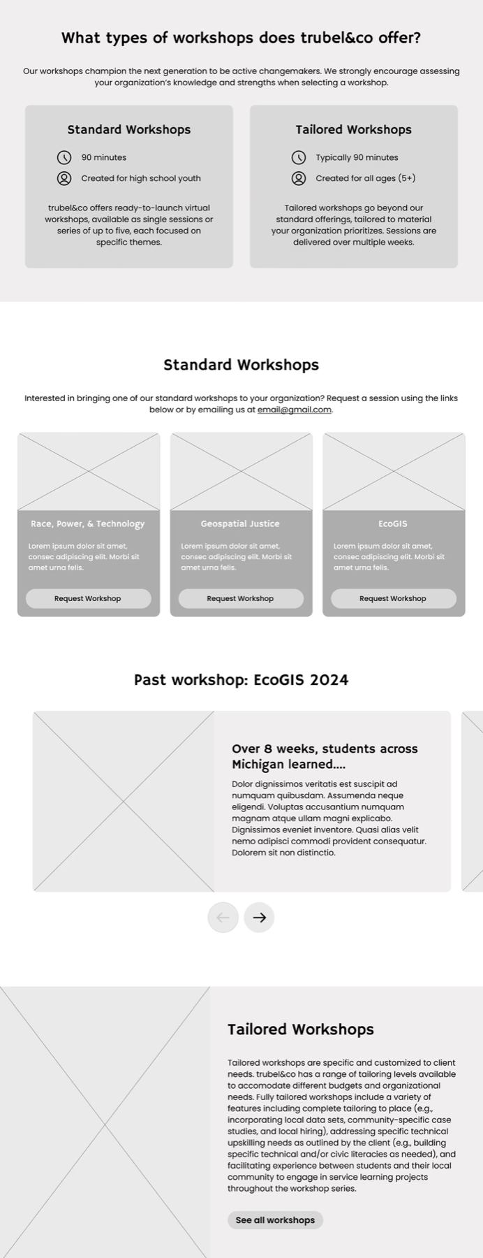
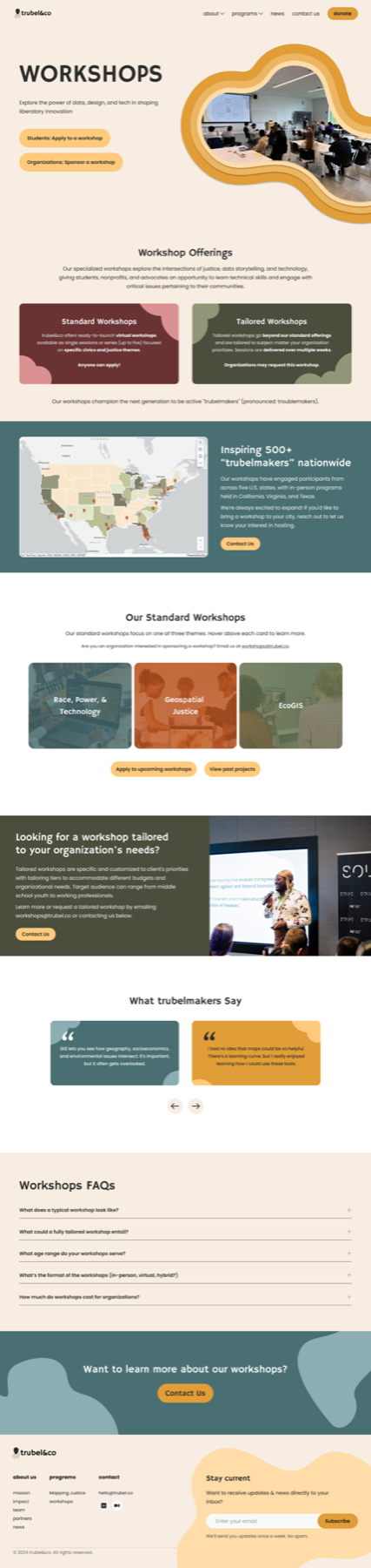
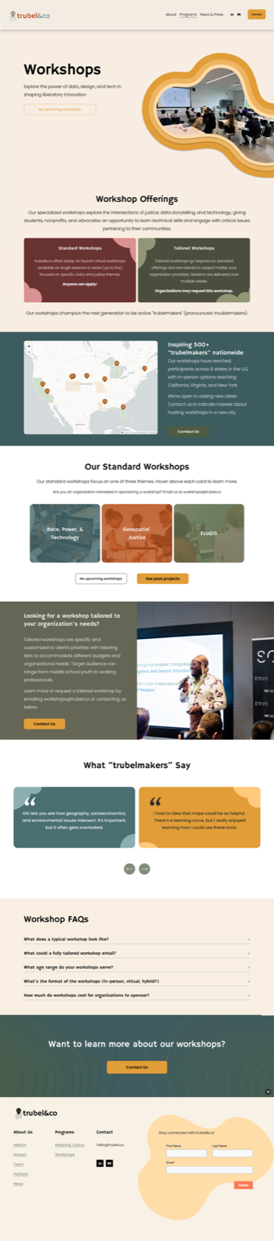
For the Workshops page, I designed a layout that clearly separated user eligibility, highlighted workshop themes, and outlined the type of work involved.
At this stage, I focused on reorganizing the layout while adding new elements, such as testimonials, an FAQ section, and a past workshops feature, to give users clearer expectations. A key question that emerged was whether to begin the page with general workshop information or to separate audiences from the start and structure all subsequent sections accordingly. The latter was chosen.


I began with a low-fidelity design that transformed into 2 alternative designs. The second design was chosen to proceed with.
Since our client-side contact wasn't part of the team managing workshops, I received weekly feedback on new constraints and additional information. At this stage, I also explored ways to make the website more engaging with custom code while keeping within Squarespace's limitations.
.png)
Previous design: Pressing the buttons within each card revealed past workshops in that theme
New design: Hovering over a card reveals more about that workshop type
New design: Pressing on these buttons allows users to see upcoming workshops or past workshops
I iterated on the initial design to explore different ways of organizing information about workshop themes, past workshops, and upcoming sessions.
During this phase, I saw the potential to improve the overall flow for signing up for a workshop.
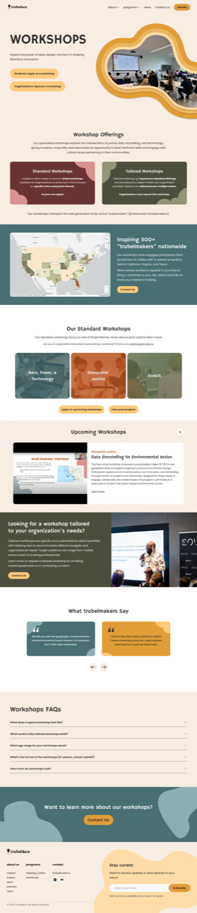
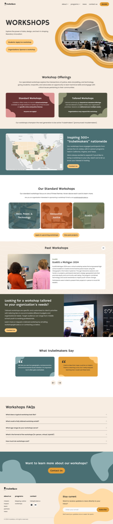
When a new workshop is added, trubel&co includes it in the navigation bar. To avoid overcrowding it, I proposed an accordion section on the Workshops page to showcase upcoming workshops, each linking to its individual page.
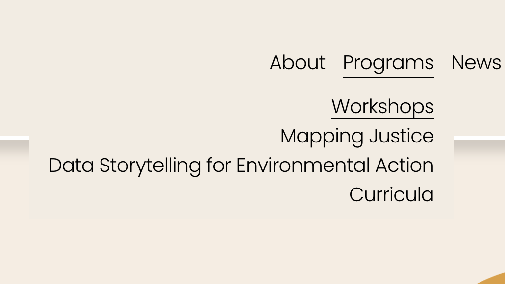
Previous design: Upcoming workshops were added to the navigation bar
New design: Access a roster of upcoming workshop by clicking on “Apply to upcoming workshop”
Upcoming workshops were previously added as a tab in the nav bar, but the redesign keeps them listed in the Workshops page
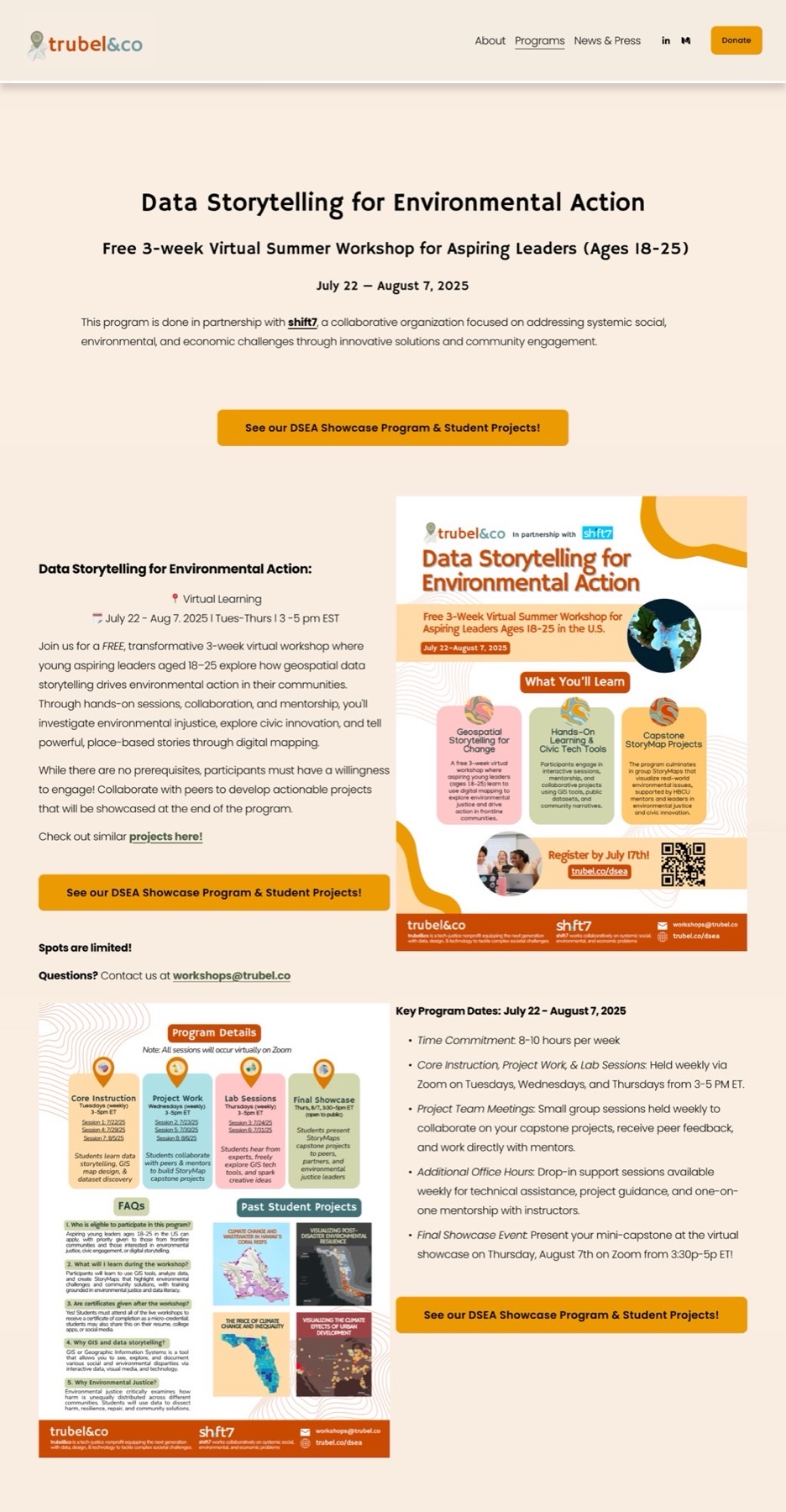
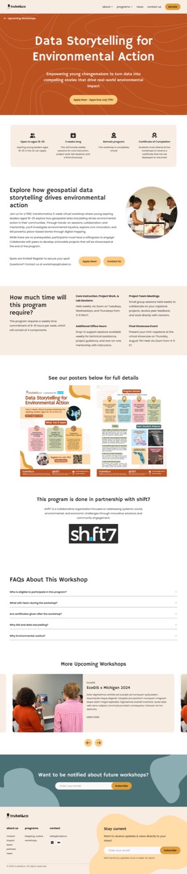
The old designs relied on blocks of text, posters, and application links. I analyzed their promotional materials to identify recurring information — program descriptions, locations, objectives, sponsor details, and timelines — and used that as the foundation for a structured page template, making the content easier to follow without losing the detail the posters provided.
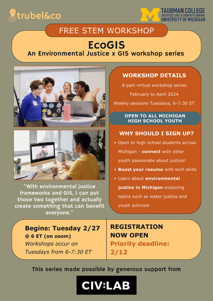
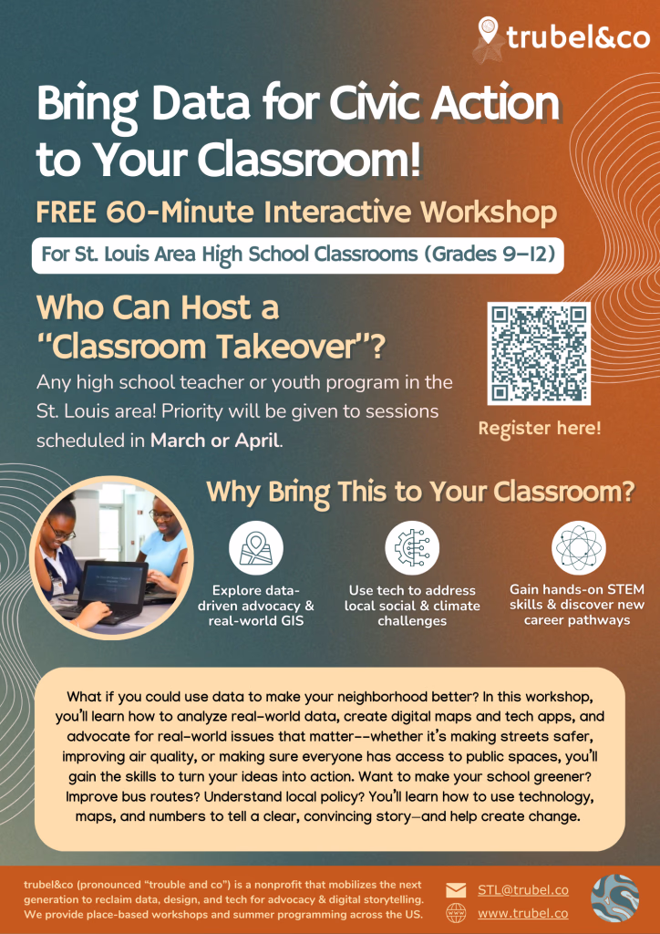
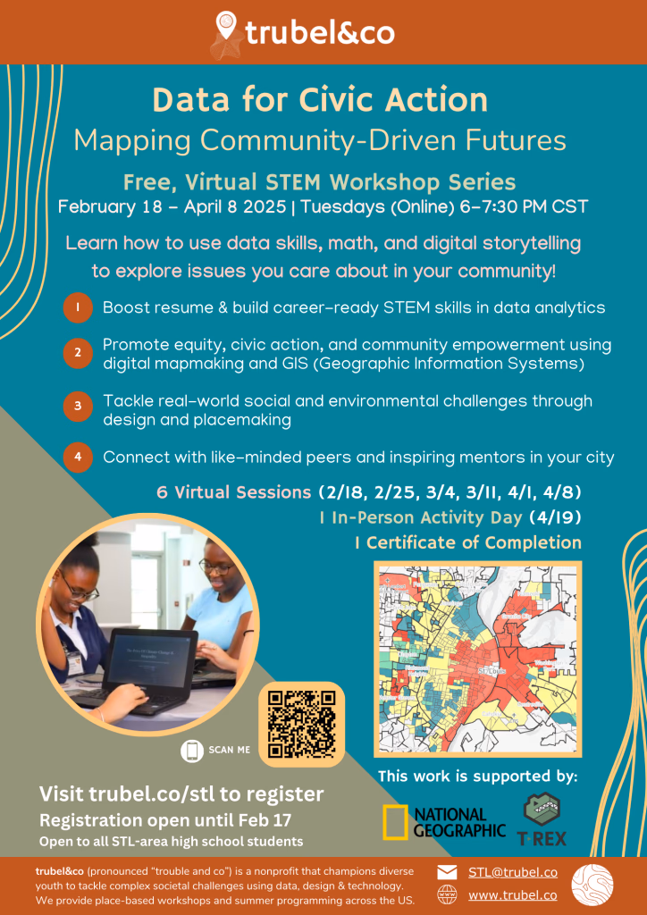
A few of their posters
Previous design
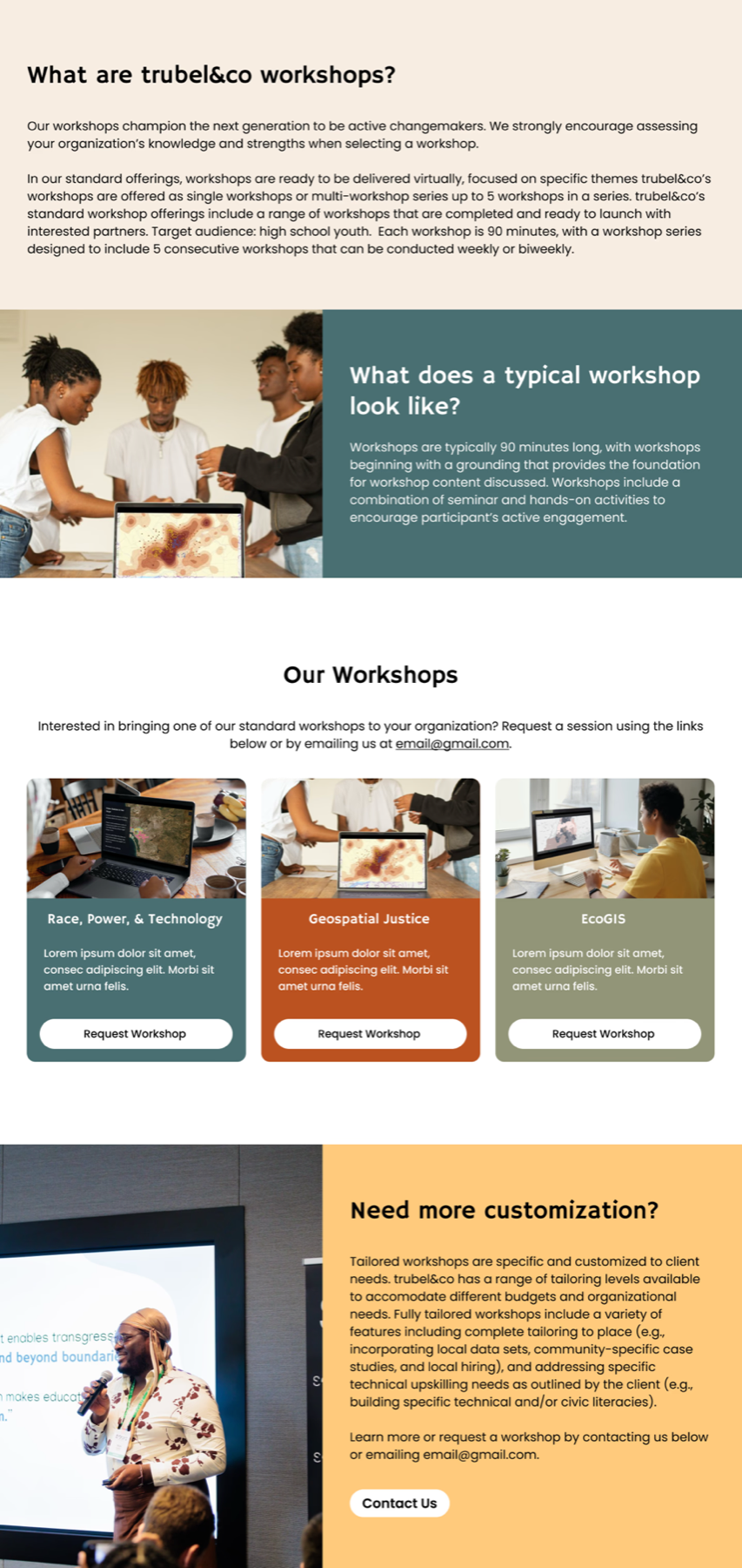
New design: Pulls out important, shared information from the posters
I iterated on the initial design to explore different ways of organizing information about workshop themes, past workshops, and upcoming sessions.
Since I was ahead of the design timeline, I also took on the News & Press page and its individual blog posts.
Earlier user testing flagged the bottom half of the News & Press page as clunky due to large text and images, which I addressed through layout adjustments. Given Squarespace's limited blog options and the complexity of their Elfsight LinkedIn integration, I skipped a high-fidelity redesign for the News & Press page — instead working directly in Squarespace to adjust the layout, blog format, and parent font styles.
Low-fidelity mockup

Elfsight LinkedIn integration
Editing blog formats directly in Squarespace
The low-fidelity mockup was presented to the client and used as a reference for direct edits in Squarespace.
Users appreciated how intuitive this new design was while still providing a clear overview about workshops.
I tested both workshop pages using a Maze survey. Since I took on the News & Press page and Blogs after user testing had already been in progress, I did not test these pages.
Final testing screens (Figma prototype)
I faced some extra constraints close to the deadline, so I prioritized addressing them during implementation.
Unfortunately, the client-side team managing these pages didn't have much of the information I was initially told would be available. While implementing the design in Squarespace, I prioritized addressing these gaps first. I also included last requests made by the client and created a document that goes over the template pages and custom code.

Earlier iteration

Final card UI
An example of how I reduced information (Upcoming Workshop cards)
Due to Squarespace limitations in using a grid system, I did have to make slight adjustments to the Figma designs.
Workshops
I redesigned the Workshops page to fit a cleaner, more playful aesthetic while reorganizing existing content for clarity. User research highlighted confusion between requesting vs. signing up for workshops, so I clarified the distinction and restructured the page to serve both students and donors/organizations.
I also introduced an interactive map to showcase past workshop locations, added a new section to preview upcoming workshops with application links alongside highlights of past workshops and past student testimonials, and created a dedicated FAQ to address common workshop-related questions.
Upcoming and Previous Workshops
Previously, upcoming workshop pages were dominated by a single paragraph of text, with most details hidden in a poster at the bottom.
In my redesign, I surfaced critical information at the top, paired with a clear CTA to apply. Below, I added space for a program overview, an optional section on what students will learn, and the promotional poster for supplemental details.
To keep the page actionable, I included dual CTAs to apply or contact the team, a sponsor highlight, an optional section for upcoming workshops, and a direct contact form for inquiries. Additionally, I introduced (green, clay, teal) to align standard workshops with themes from the main Workshops page, while ensuring the page itself remained self-explanatory without relying on color.
News & Press
I refined the News & Press page to align with the updated aesthetic, highlighting ongoing developments through a preview of LinkedIn posts and showcasing trubel&co's history of achievements and impact.
Individual Blog Post
I also streamlined the individual blog posts, creating a cleaner, more consistent format that remains easy for the team to reproduce.
Since Squarespace restricts how these pages are edited, I edited the site's style settings to ensure that future blog posts follow a similar format. I edited 12 existing blogs to make sure that they followed a similar format.
Redesigning problematic sections for good measure
This project started as a Workshops page redesign, but it grew into much more. Part of the reason why was my initiative to identify and solve problems, even those outside of my scope.
"I had the opportunity to work with Monica Cortes on a website redesign for my nonprofit, and I can confidently say that she is nothing short of an expert in her craft."
"From the outset, Monica produced beautiful, high-quality designs that directly addressed our challenges and aligned seamlessly with our needs. What stood out most was her thoughtful, curated approach—she consistently incorporated feedback from user research and testing, ensuring that every iteration of the redesign improved and elevated the user experience.
Monica also demonstrated an exceptional ability to collaborate with executive leadership, quickly translating broad or non-technical ideas into designs that were not only aesthetically strong but also strategically aligned with the end user's needs. Even when tasked with a single page, she delivered multiple variations (four or five in some cases) all of outstanding quality. In fact, her work set such a high bar that I used it as the benchmark for quality assurance across the entire project.
Beyond her technical skill, Monica brought bright ideas, thoughtful solutions, and visible passion to every meeting. Her talent and craft are matched by her professionalism and her clear dedication to delivering the best possible result."
Special thanks to Develop for Good, everyone on my team, and trubel&co!

As someone looking to grow as a designer while working on projects with real impact, joining DFG's project with trubel&co was a no-brainer. It was the perfect opportunity to apply my skills to a real-world effort — and I'm glad it connected me to an organization doing meaningful work.
Thank you to trubel&co and our contact Aizhaneya for making this an enjoyable experience. I felt prepared to explain my design choices and appreciated the recognition for my work.
And thank you to my team for always being so helpful and positive each week. Special shoutout to Danielle S. and Justin P. for being excellent managers during my first ever project for Develop with Good!