Designing the university's 2024 accreditation report
As the sole designer of UC Berkeley's 2024 WSCUC accreditation report, I helped contribute towards a successful accreditation outcome.
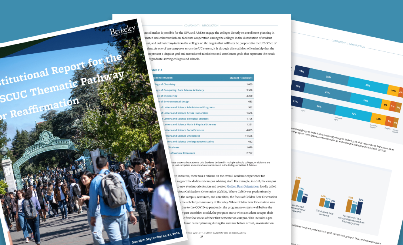
Every 10 years, WSCUC (Western Association of Schools and Colleges Senior College and University Commission) conducts a reaccreditation process to ensure universities maintain high academic standards. Using Adobe InDesign and Adobe Illustrator, I created an 80+ page report that was presented to UC Berkeley staff, faculty, students, and a WSCUC Committee.
Below are several pages of my work.
I contributed to a successful reaccreditation of UC Berkeley, following an on-site visit where this report was presented to faculty, staff, students, and WSCUC committee members.
You can view the full report here.
But how did I get here?
I transformed a plain, 100+ page Google Doc into a report unique to UC Berkeley's brand.
I joined this project while the UC Berkeley UED team were in the midst of revising their initial copy. There was no designated designer up until my arrival, so text and graphs were being added directly into Google Docs from Google Sheets.
A few of the original pages
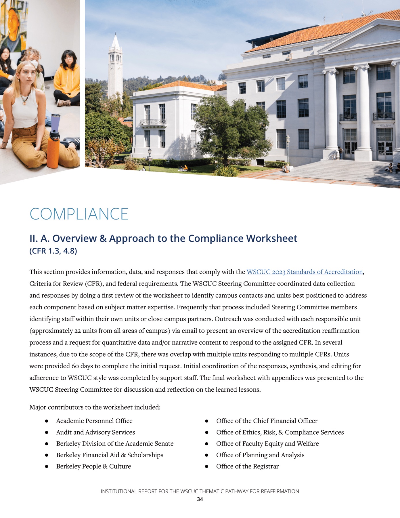
The report was shaped around UC Berkeley's brand guidelines and the needs of a text-heavy document.
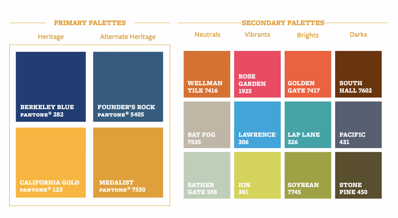
UC Berkeley's branding offers a primary palette that taps into their iconic blue and gold colors, with a secondary palette of neutrals, vibrants, brights, and darks to complement that.
University branding also relied on a few visual elements: structural elements, apertures, and tessellations. With the exception of structural elements, graphic elements can never be used more than once within a piece of design.
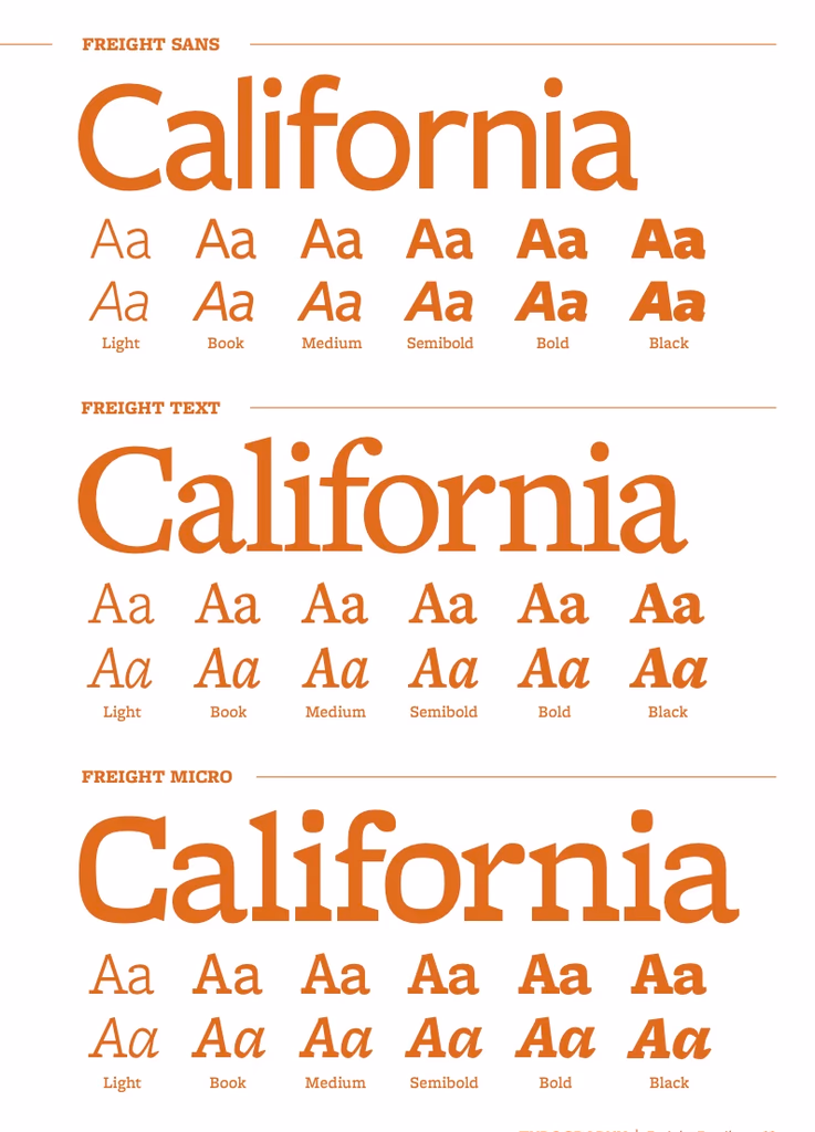
Given that the report highlighted Berkeley's history, recent achievements, and future plans, I wanted to primarily feature their historic blue and gold shades (primary palette). And, given the report's text-heavy nature, Open Sans was chosen for the body text for easier readability.


UC Berkeley's brand identity (prior to their summer 2024 rebrand)
Having a background in layout design but no experience creating a higher-education report, I found inspiration from other university reports.
The team was interested in going above a plain B&W document, which was common across other WSCUC reports I saw. My source of inspiration and reference derived from 2 past reports: UCI's Thematic Pathways for Reaffirmation (TPR) report and a UC disabilities report.
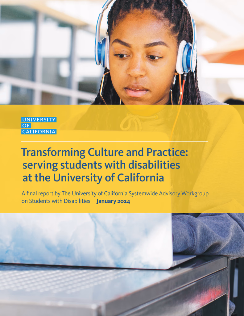
I pulled inspiration from this report to understand how higher ed documents work
Multiple iterations were created before finalizing on a template to follow.
Given the report's text-heavy nature, a key consideration was whether to use a single-column or two-column layout. I also explored a few ways to visualize pull quotes and data tables.
These alternative designs included a bolder choice of text and inserting images as section headers.
After presenting these drafts to the team, they gave feedback for what they wanted to keep and what they preferred to avoid. Some examples include:
- Visual elements would be used in a more subtle way, i.e. tessellations would not be used in the bottom layer of each page like in the first draft.
- One column over two columns of text would be used.
- Section dividers would take up half a page, rather than a whole page.
With these considerations in mind, I spent the next few months developing the report using a finalized template.
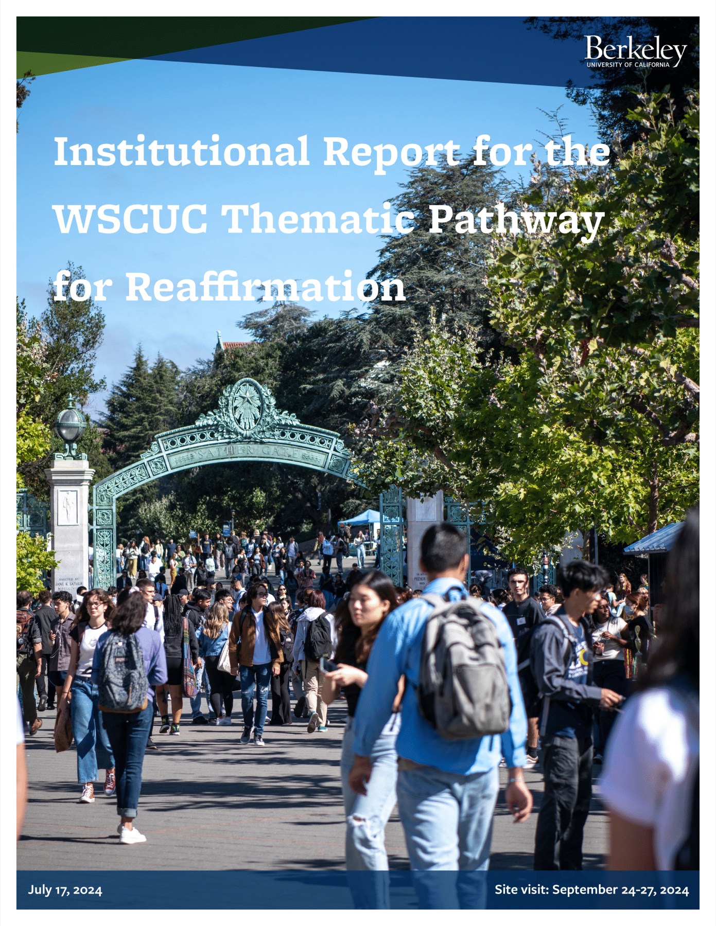
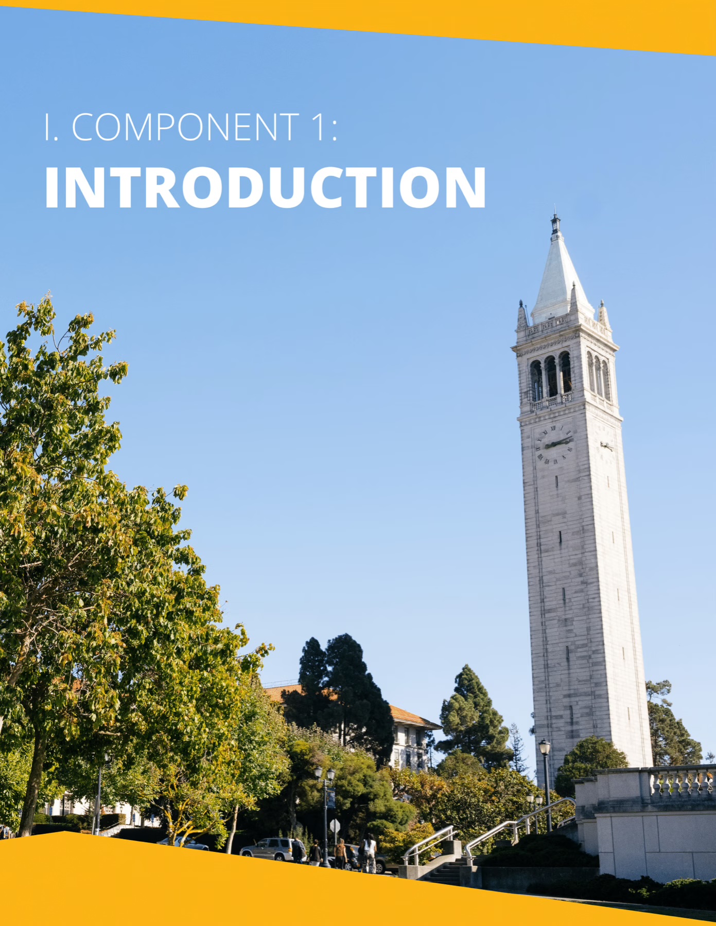
Front cover and no back cover
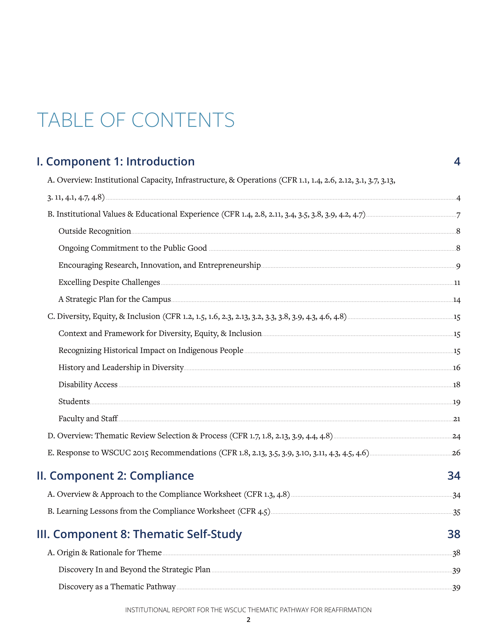
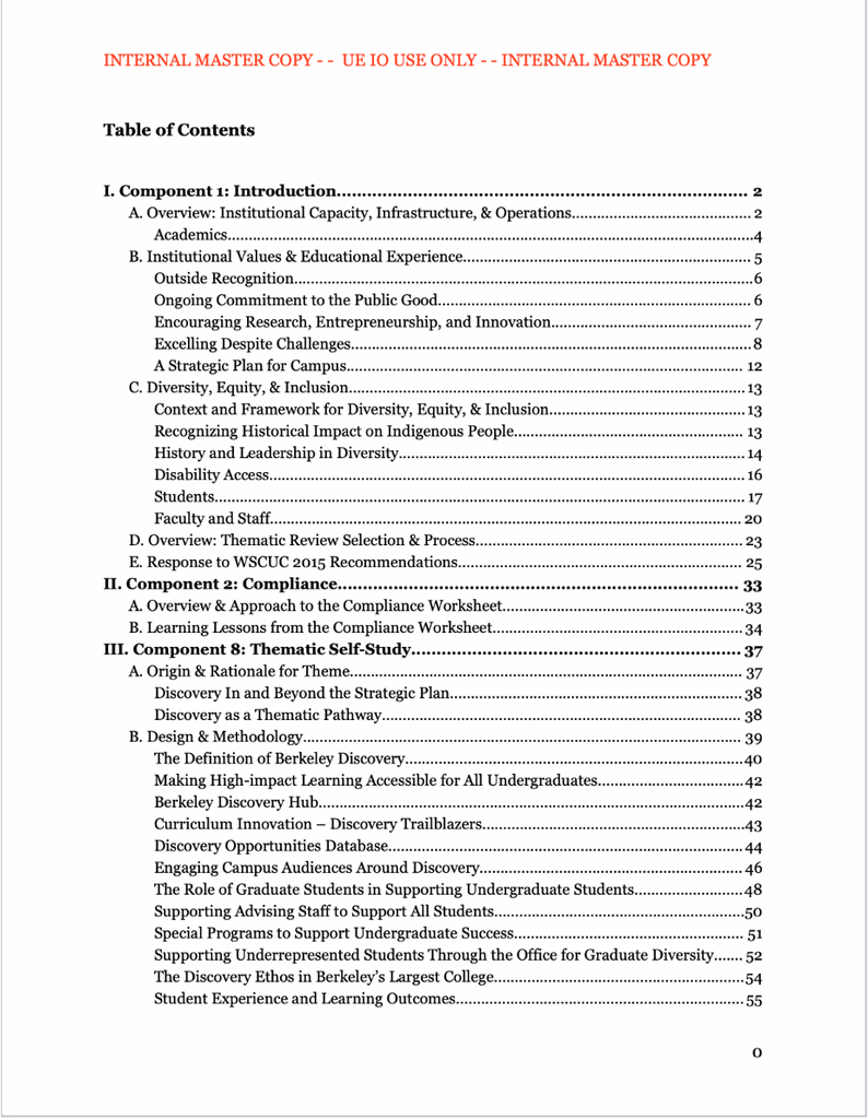
Table of contents
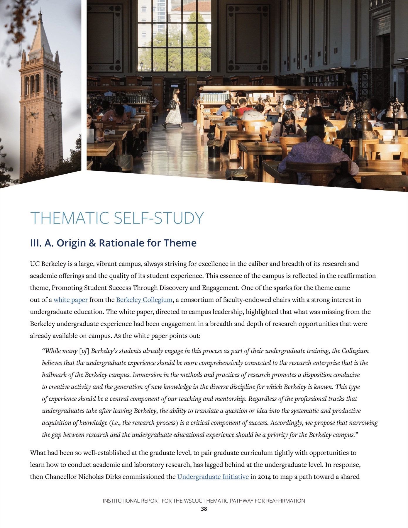
Section dividers
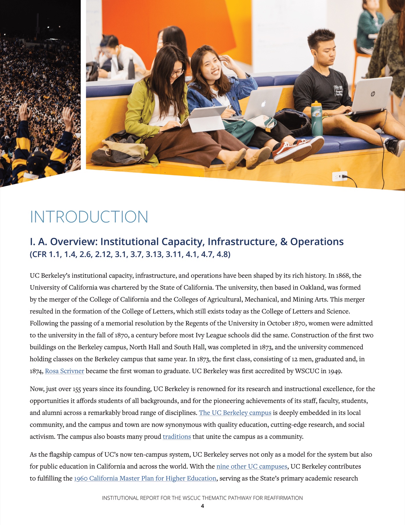
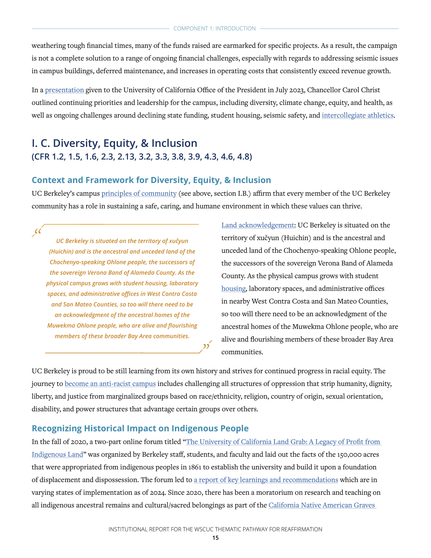
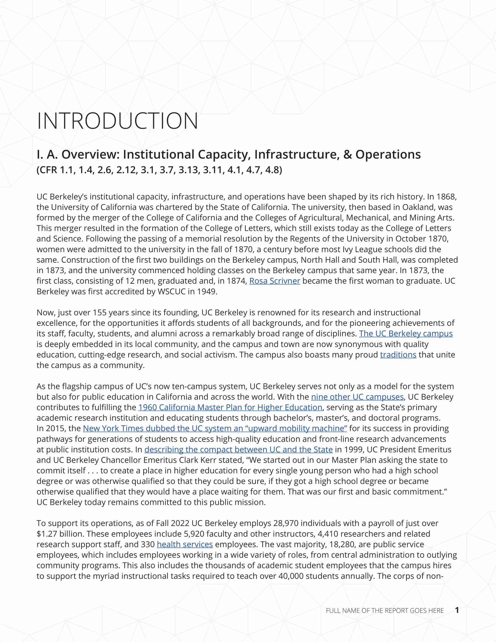
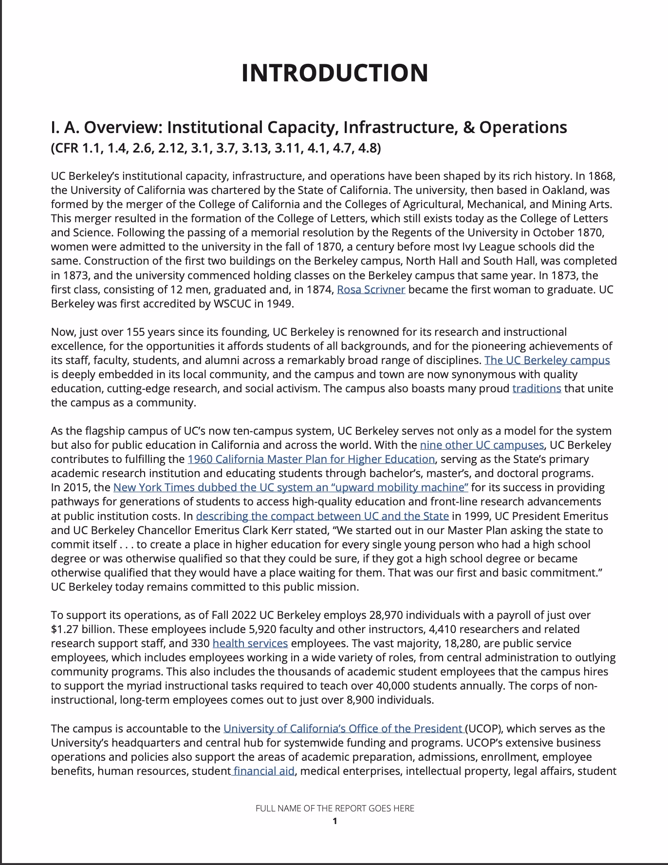
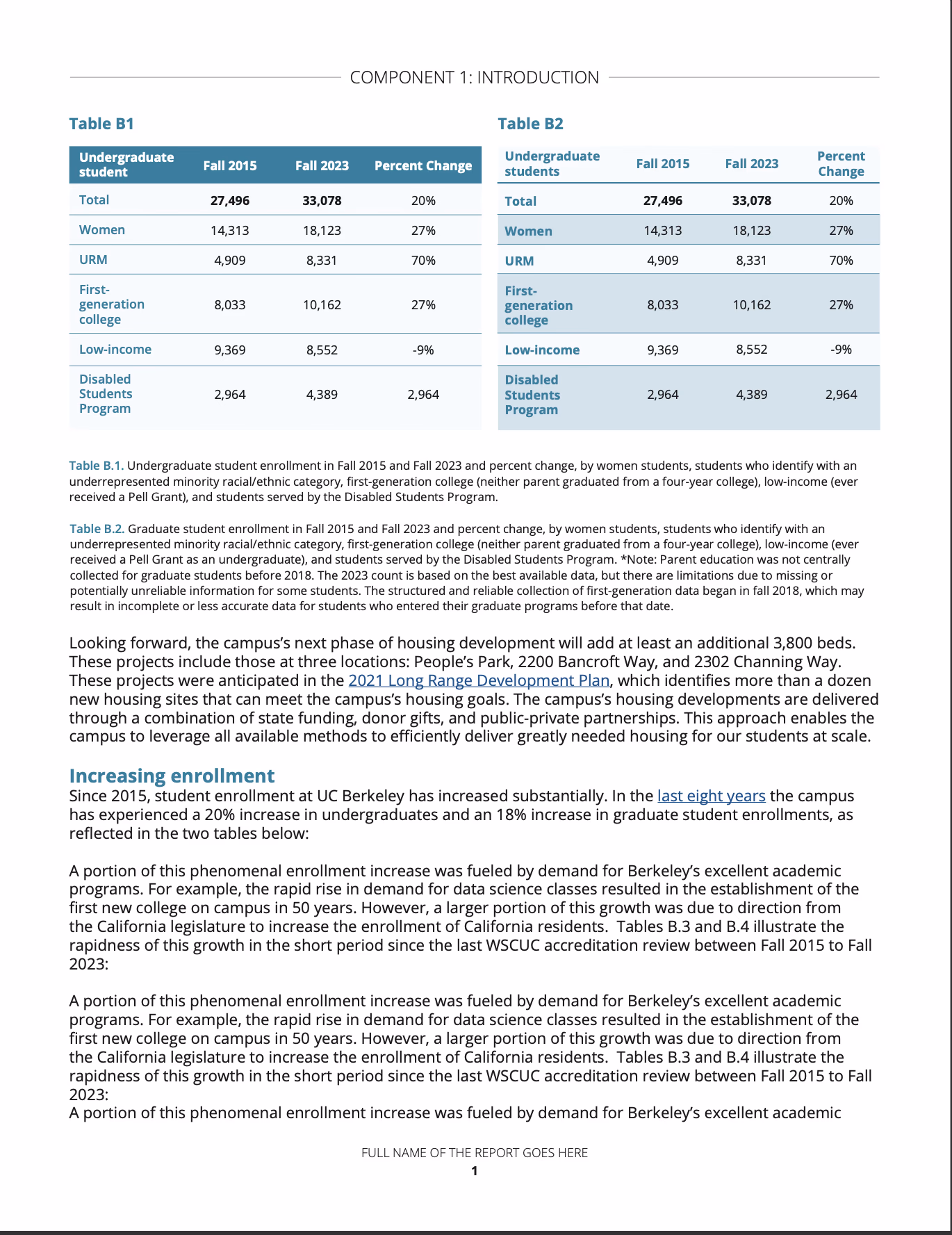
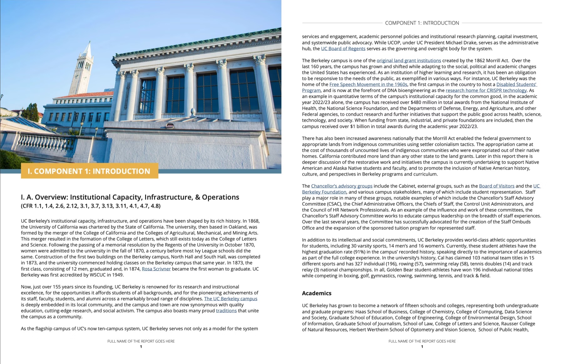
Regular pages
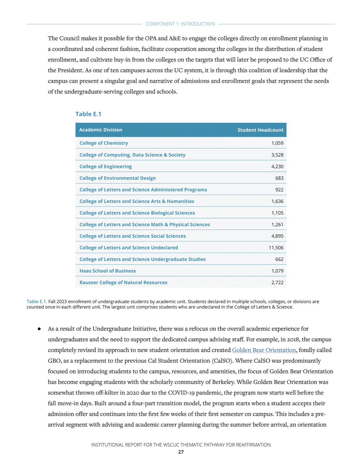
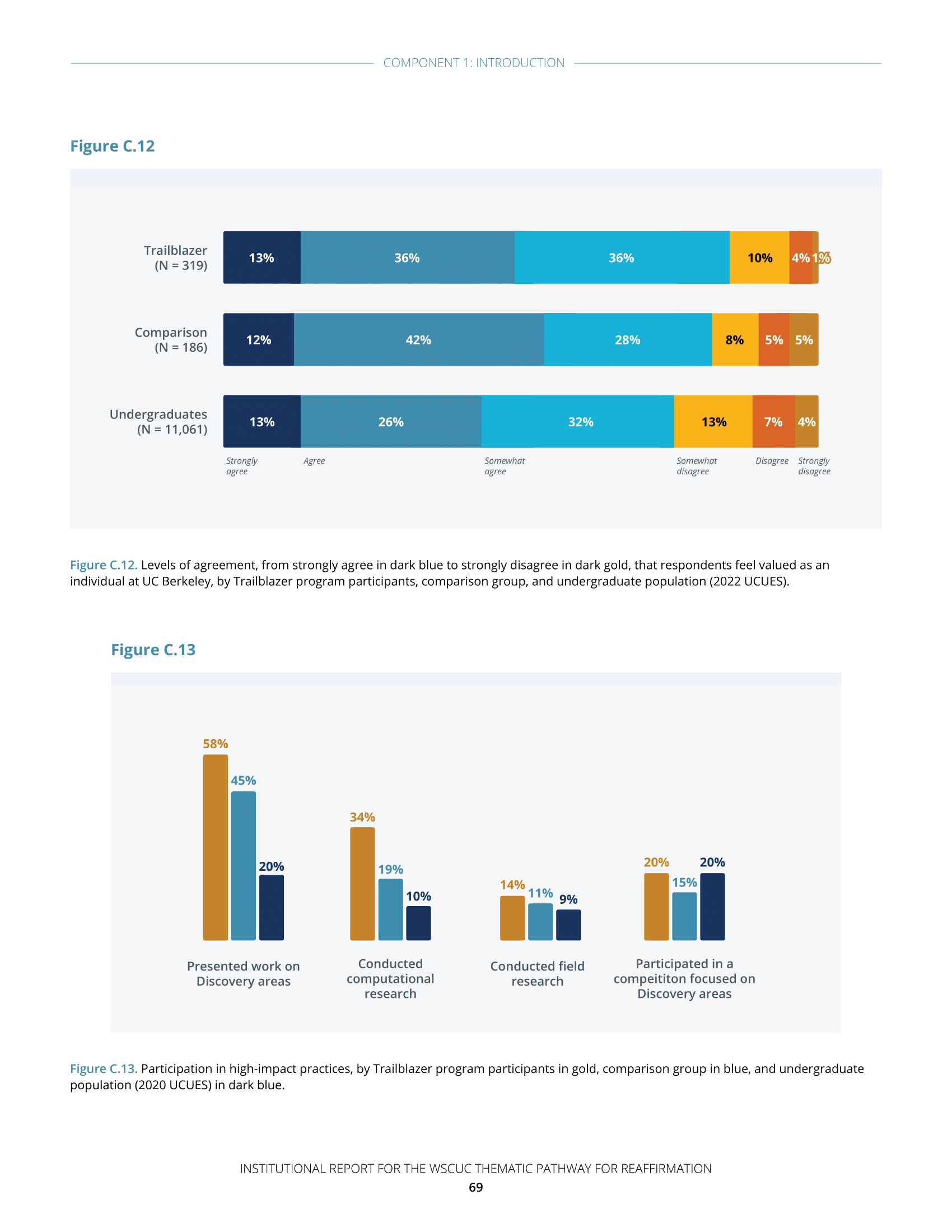
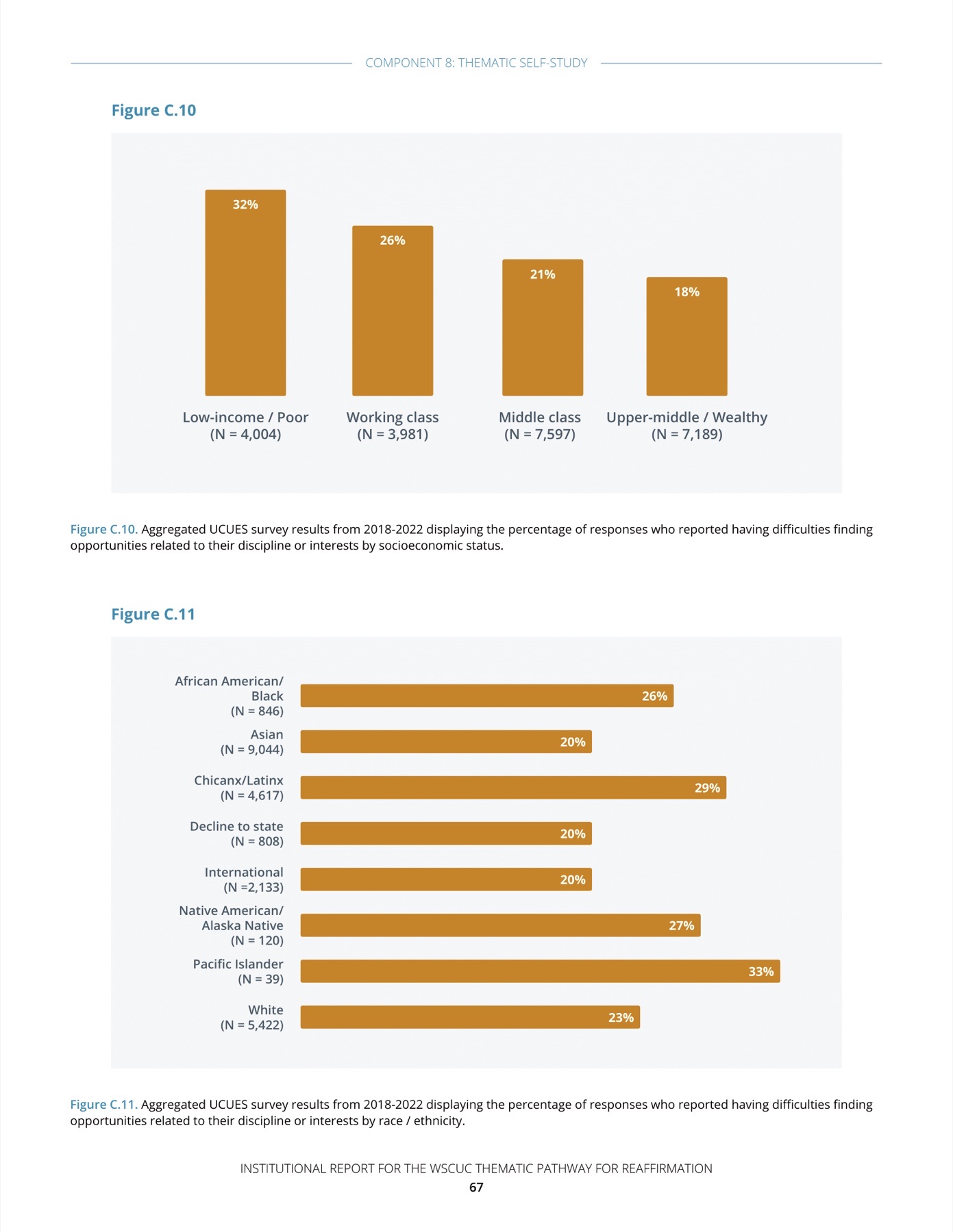
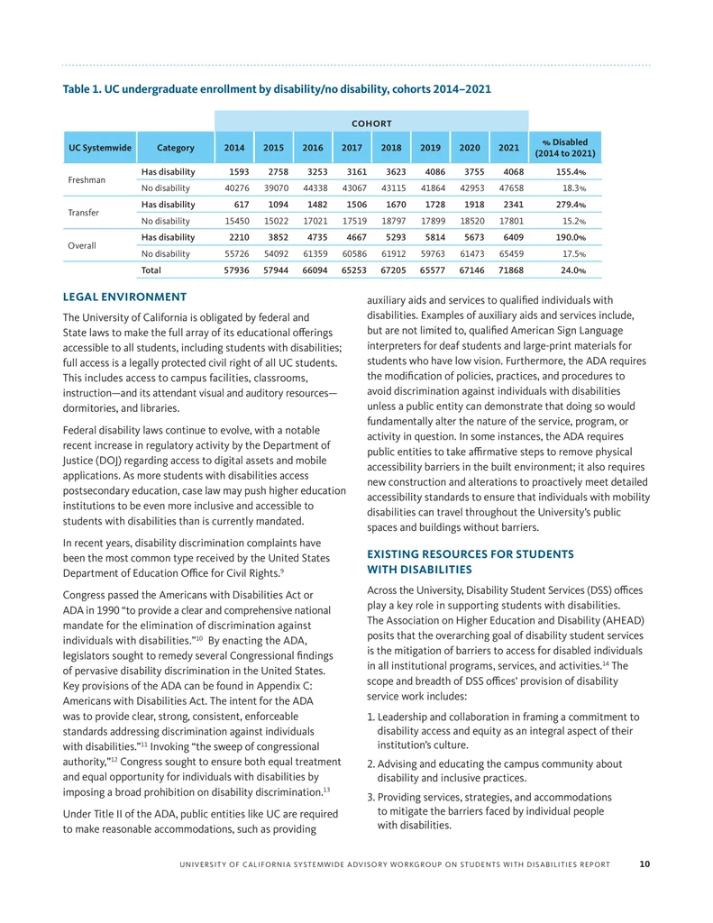
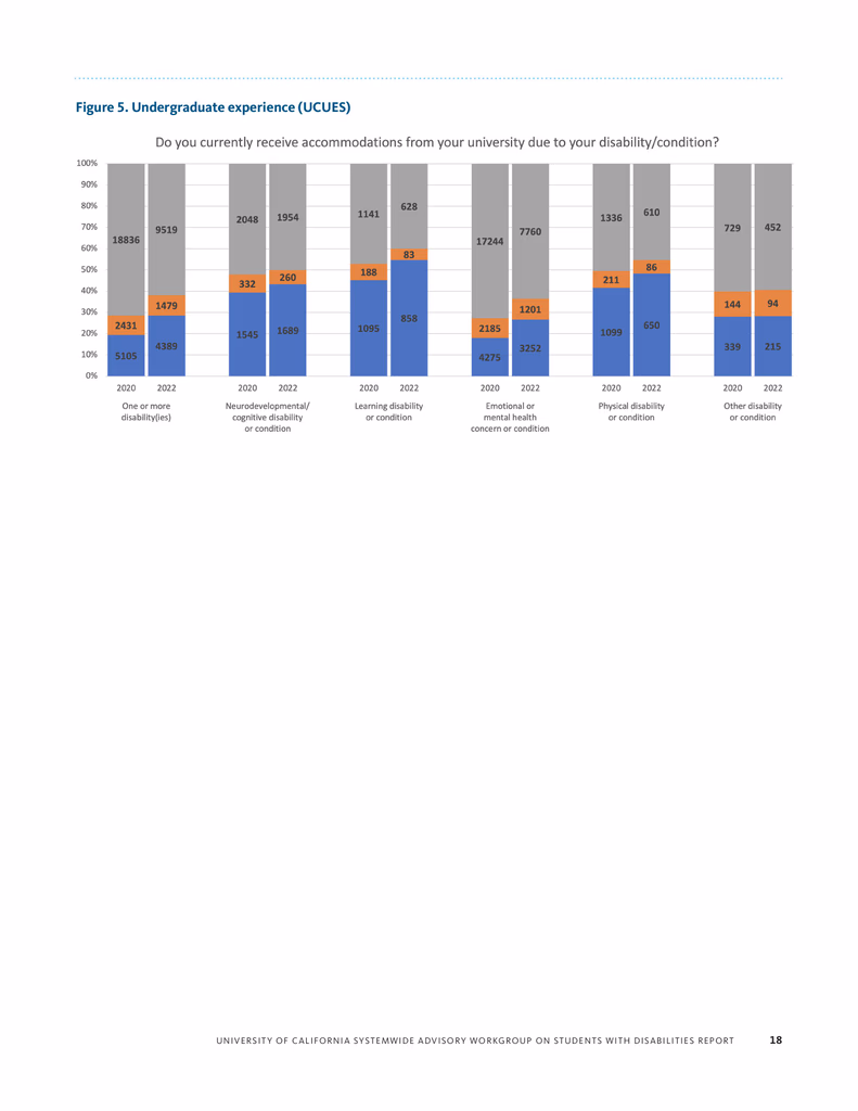
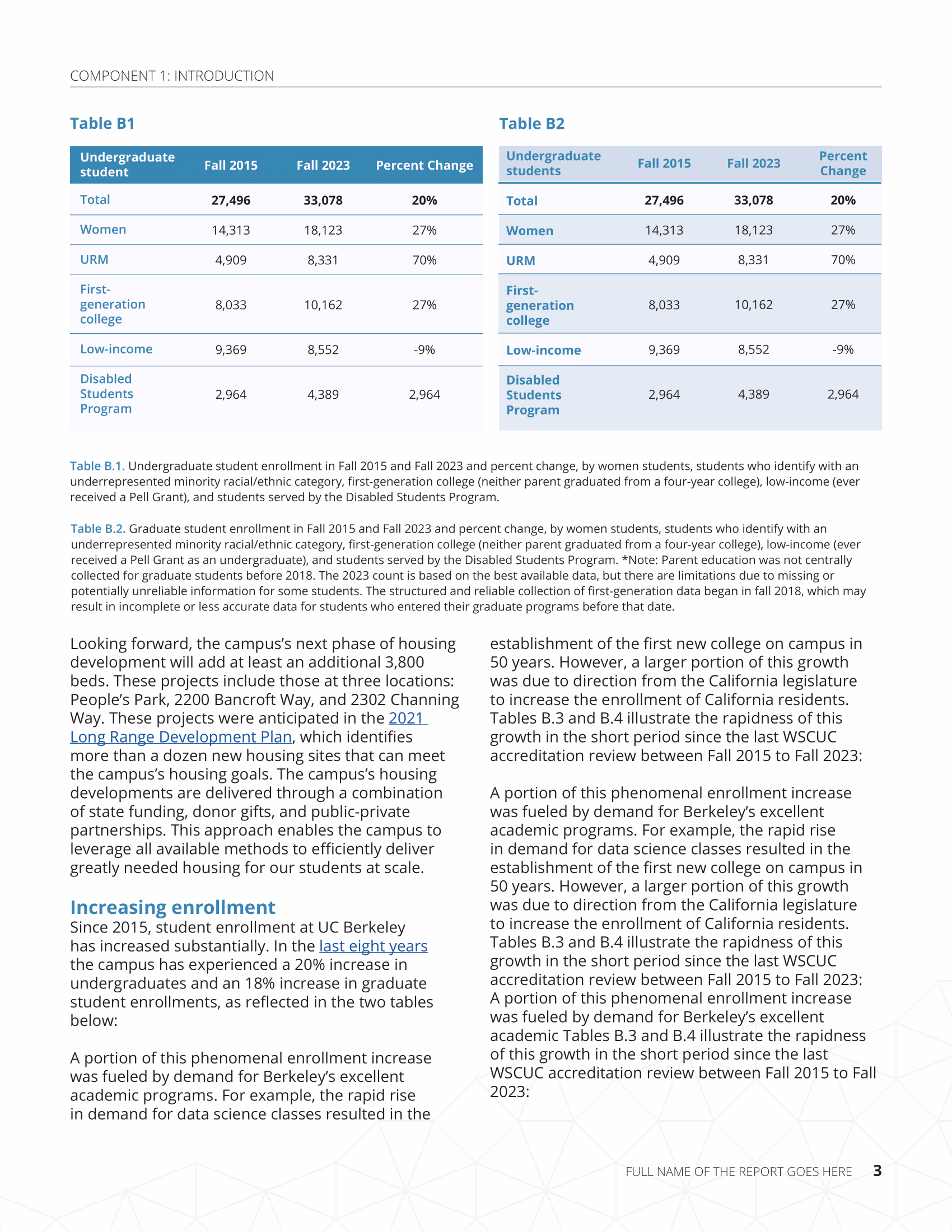
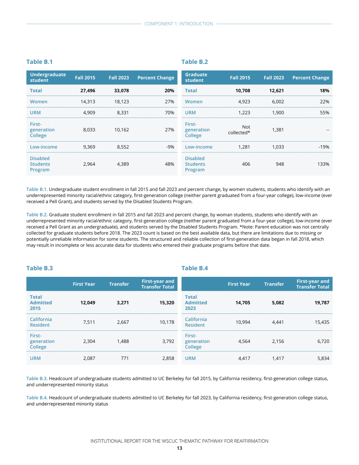
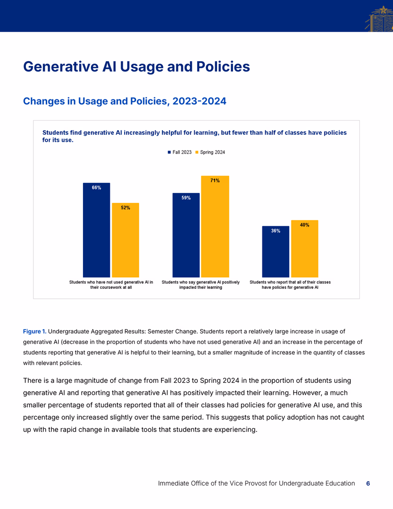
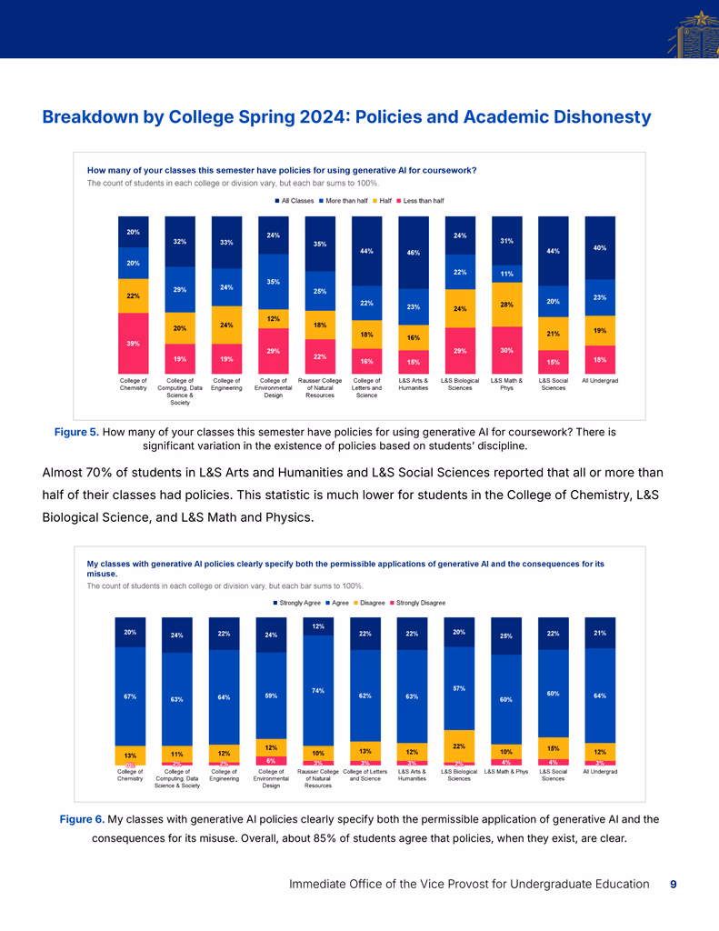
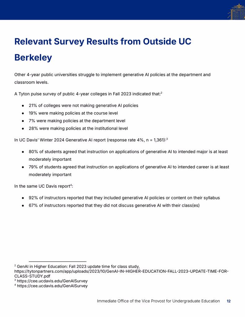
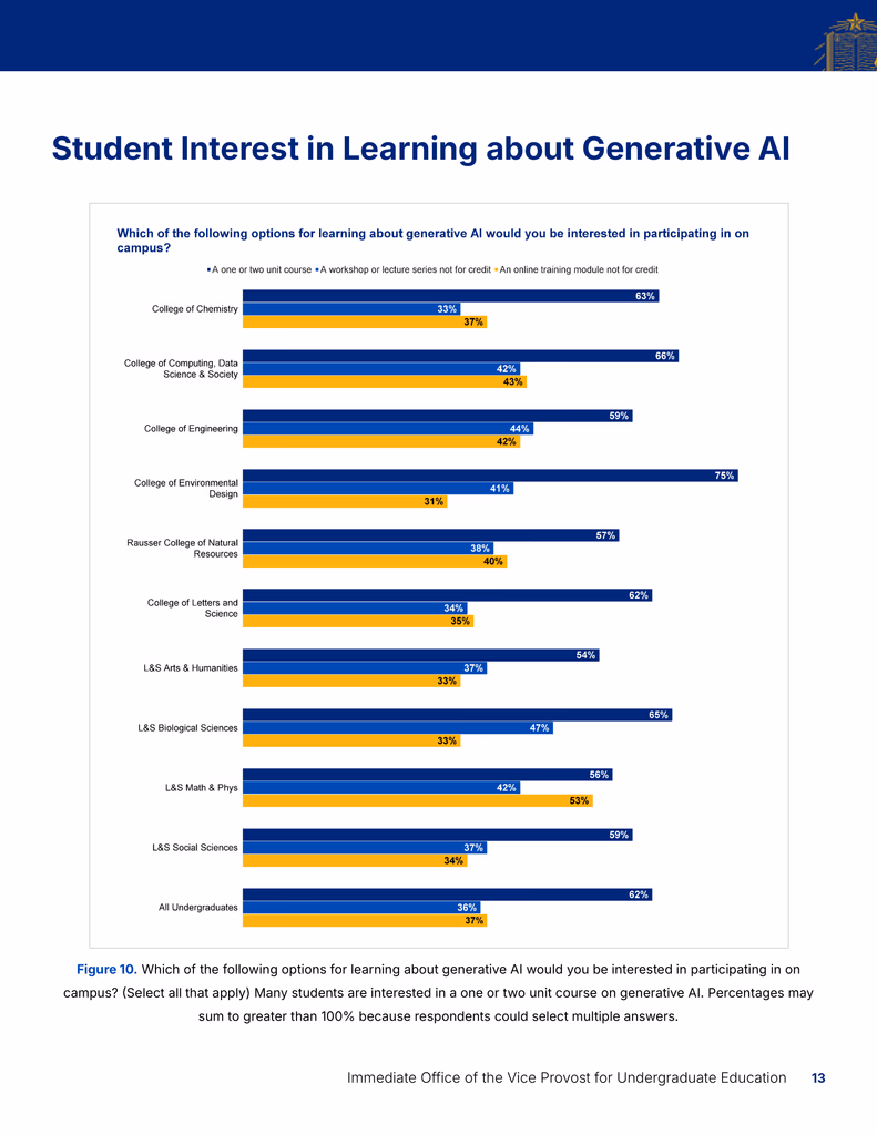
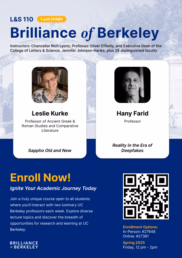
Graphs & tables
As a Visual Designer for the department, I also worked on extra reports, visualizations, and miscellaneous design projects.


Special thanks to UED!
I'm grateful to have been referred for this project by a UED staff member, which eventually led this position continuing with UC Berkeley UED after this project concluded. This project involved extensive collaboration and multiple revisions, but with the guidance of my supervisor, Berkeley's Communications Manager, the process was both rewarding and impactful.